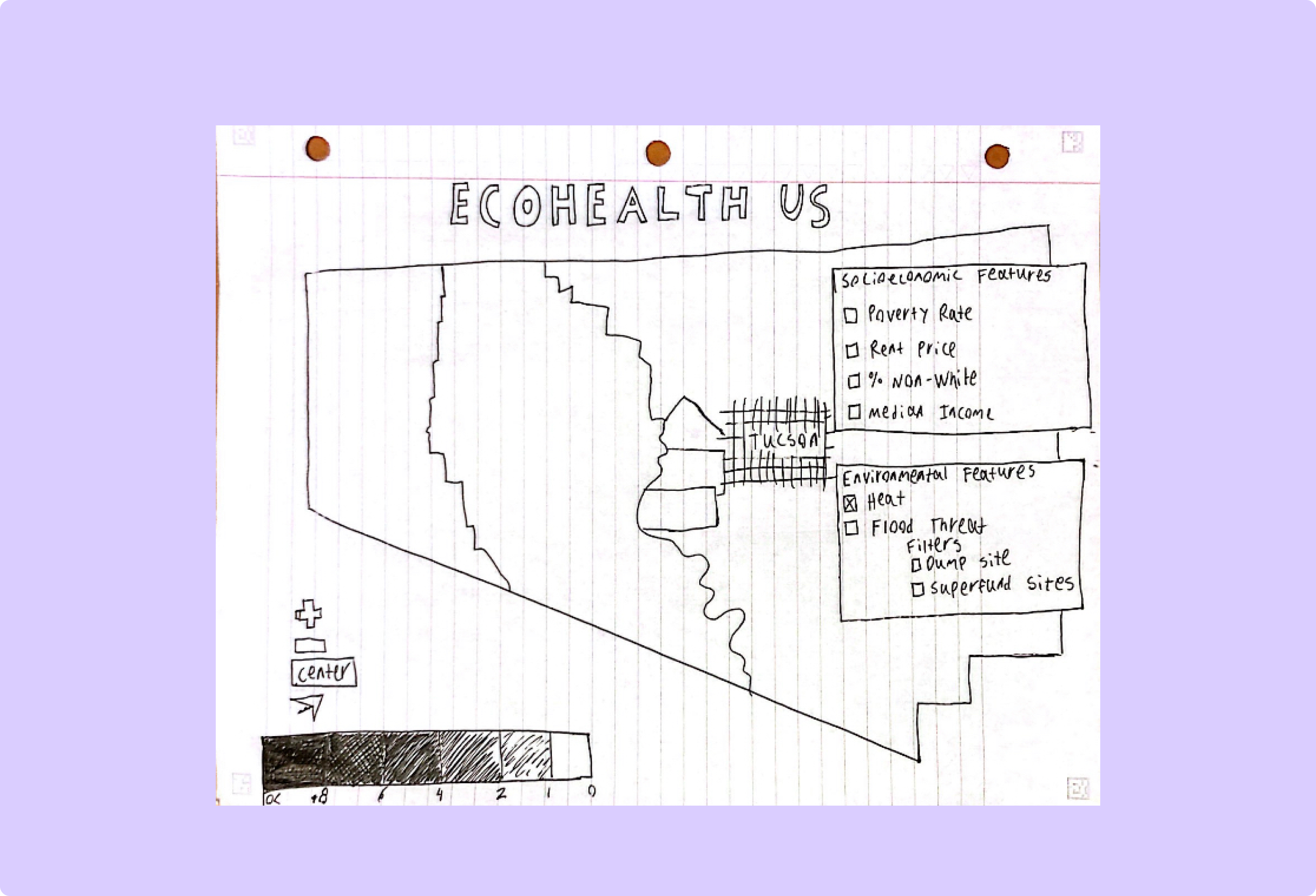
Design Process
From discussions with the community partners at the UMiami Center of Ethics and Public Service and research on existing data visualizations, an interactive map emerged as the best solution to the problem. Static maps and graphs aren’t effective at demonstrating data granularly, something the community partners emphasized in the interviews.
I also found The Opportunity Atlas as a precedent for a visualization with data similar to that I needed to show.
Even while time was severely constrained due to the need to both design and develop the product in 10 weeks, I still was able to use an iterative approach to the design, as shown below:
- 1) Product sketching
- 2) Feedback on sketches
- 3) Hi-Fi Mockups based on feedback
- 4) User feedback on mockups
- 5) Development of initial product (visible here)
- 6) User testing and feedback from community partners at UMiami
- 7) Development of final product
Page Design
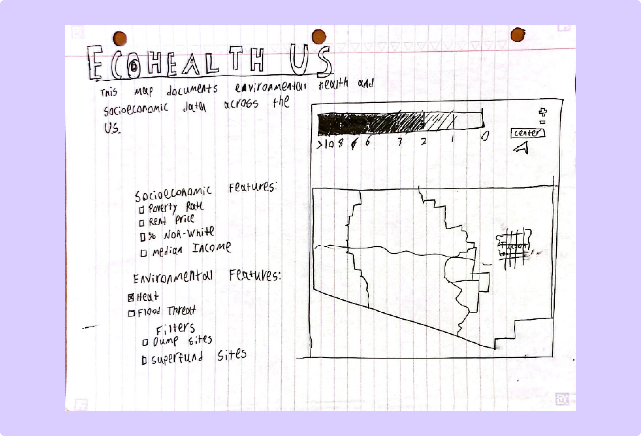
(original)
(final)
Stage: (2) Feedback on sketches
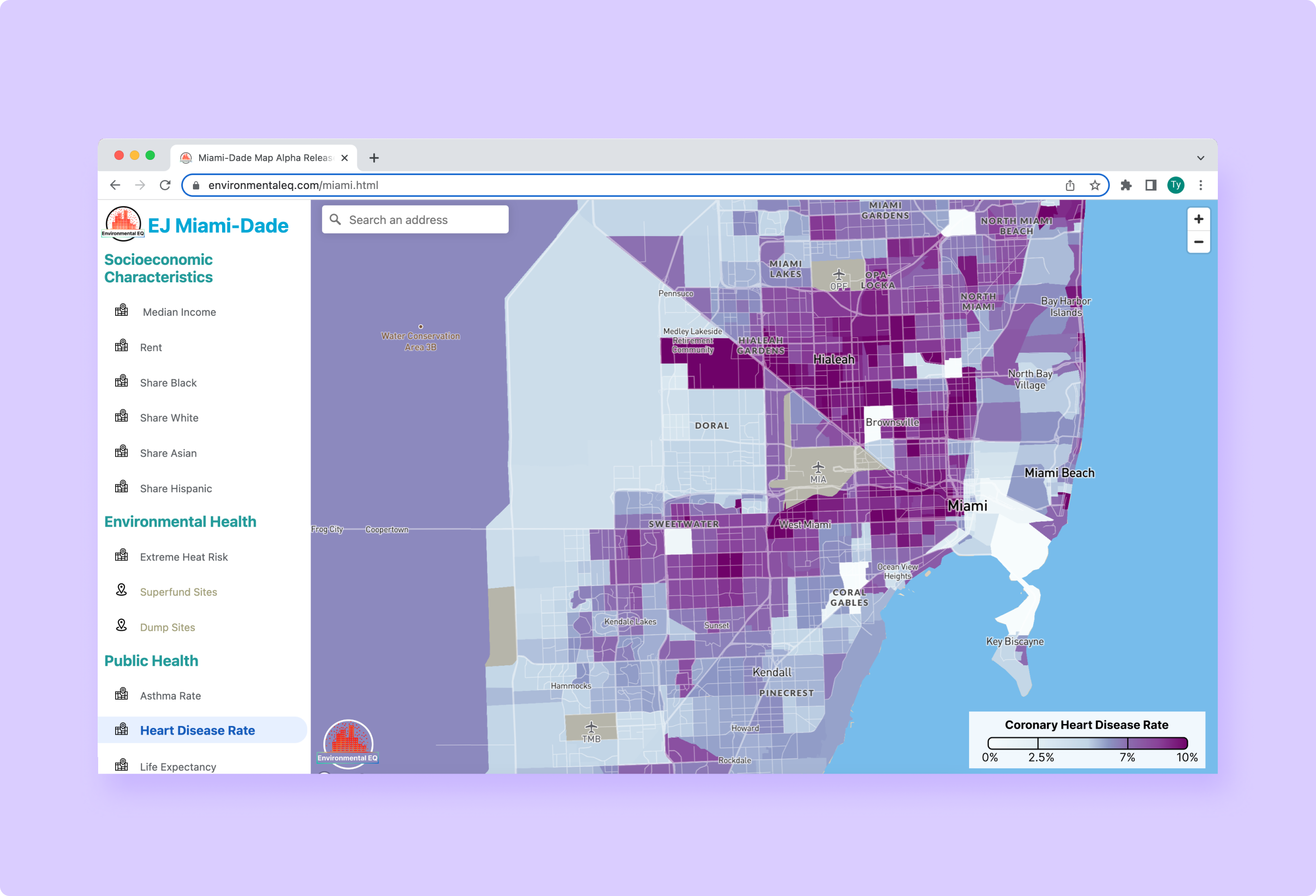
Change: Made the map take up the entire page instead of being just a section.
Rationale and Alternatives: People critiquing the sketches vastly preferred a design where the map took up the entire screen instead of just a small section of it. This makes sense as using the map is the main purpose of the site, so any extra information is extraneous.
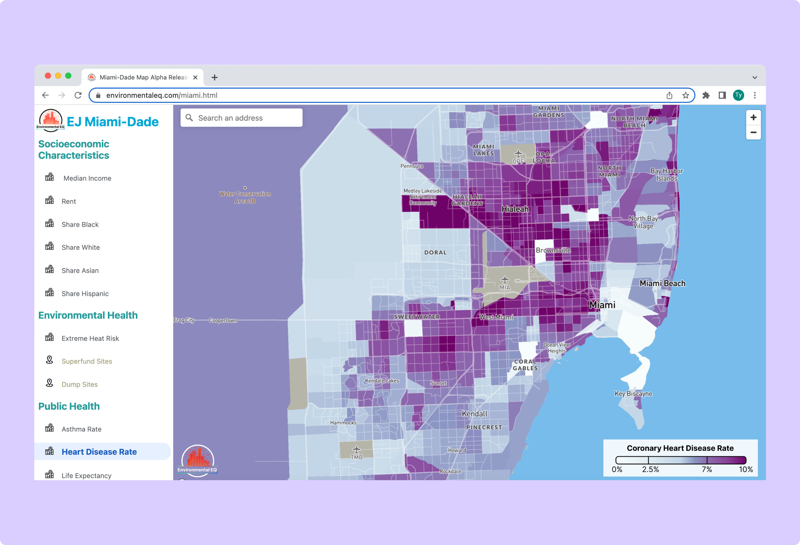
Information Display
(original)
(final)
Stage: (2) Feedback on sketches
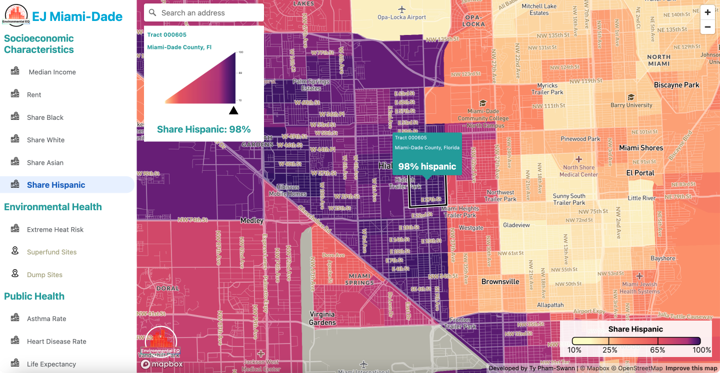
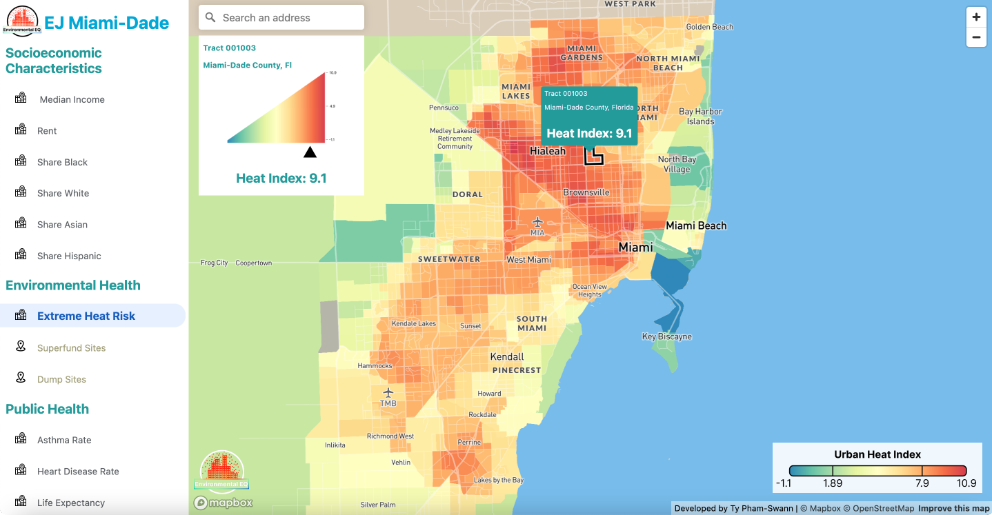
Change: Added an information display that pops up when a user clicks on or searches for a tract
Rationale and Alternatives: Someone critiquing the sketches suggested that more information being displayed when a user clicks on a specific neighborhood. This aligns with one of the main purposes of the map to allow users to see conditions in their neighborhood.
Map Legend
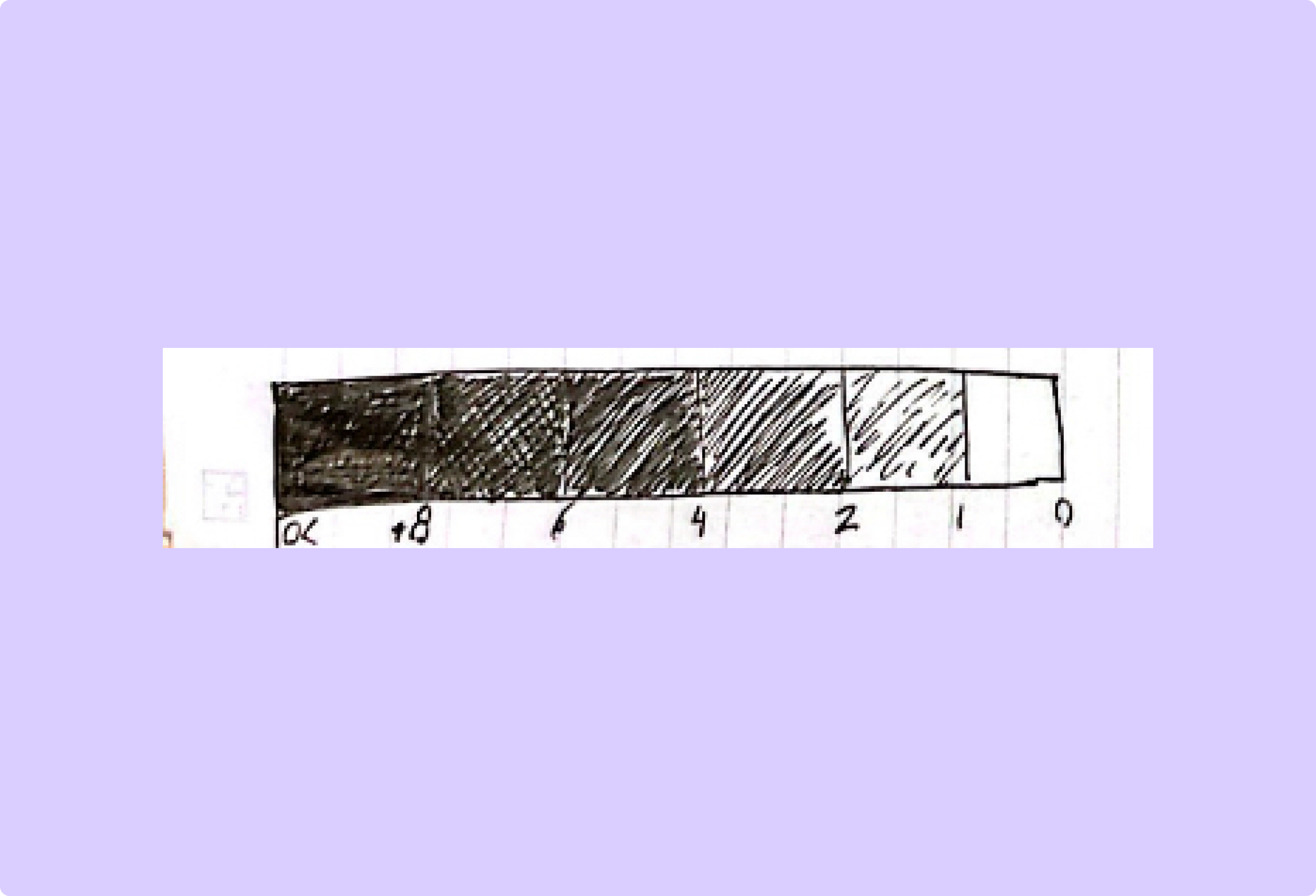
(original)
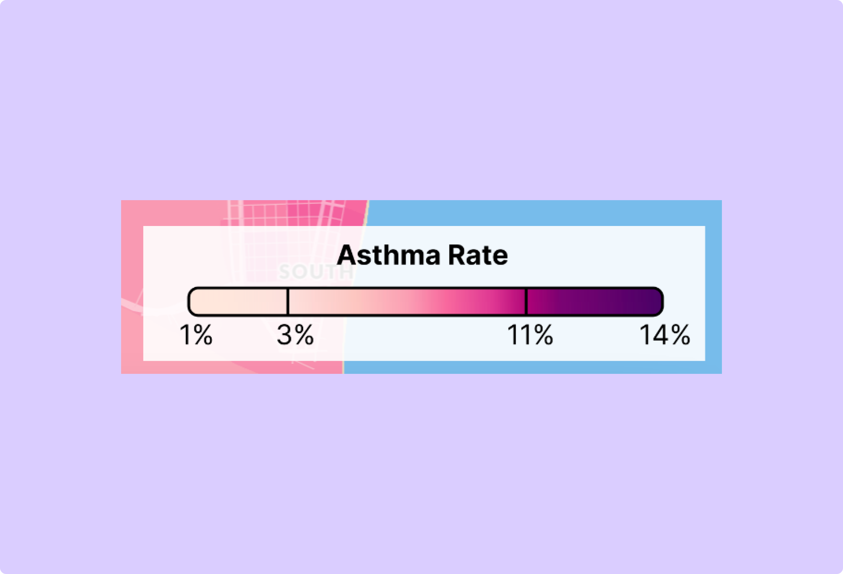
(final)
Stage: (2) Feedback on sketches
Change: Made the map legend continuous rather than discrete.
Rationale and Alternatives: A few people critiquing the sketches suggested that continuity of the data would be a more compelling representation. Later in the design process, when developing a hi-fi mockup it become apparent that this was a better approach.
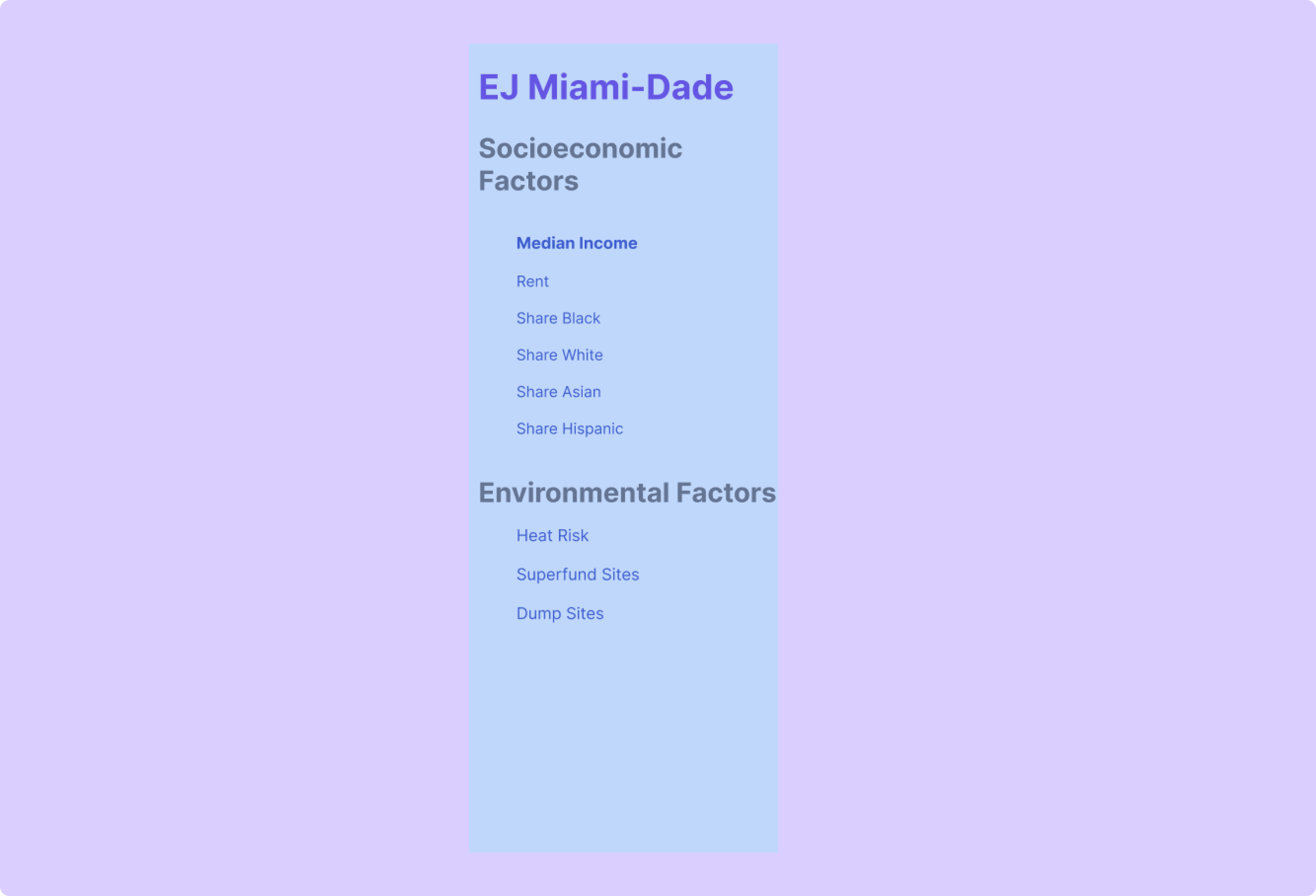
Sidebar Location
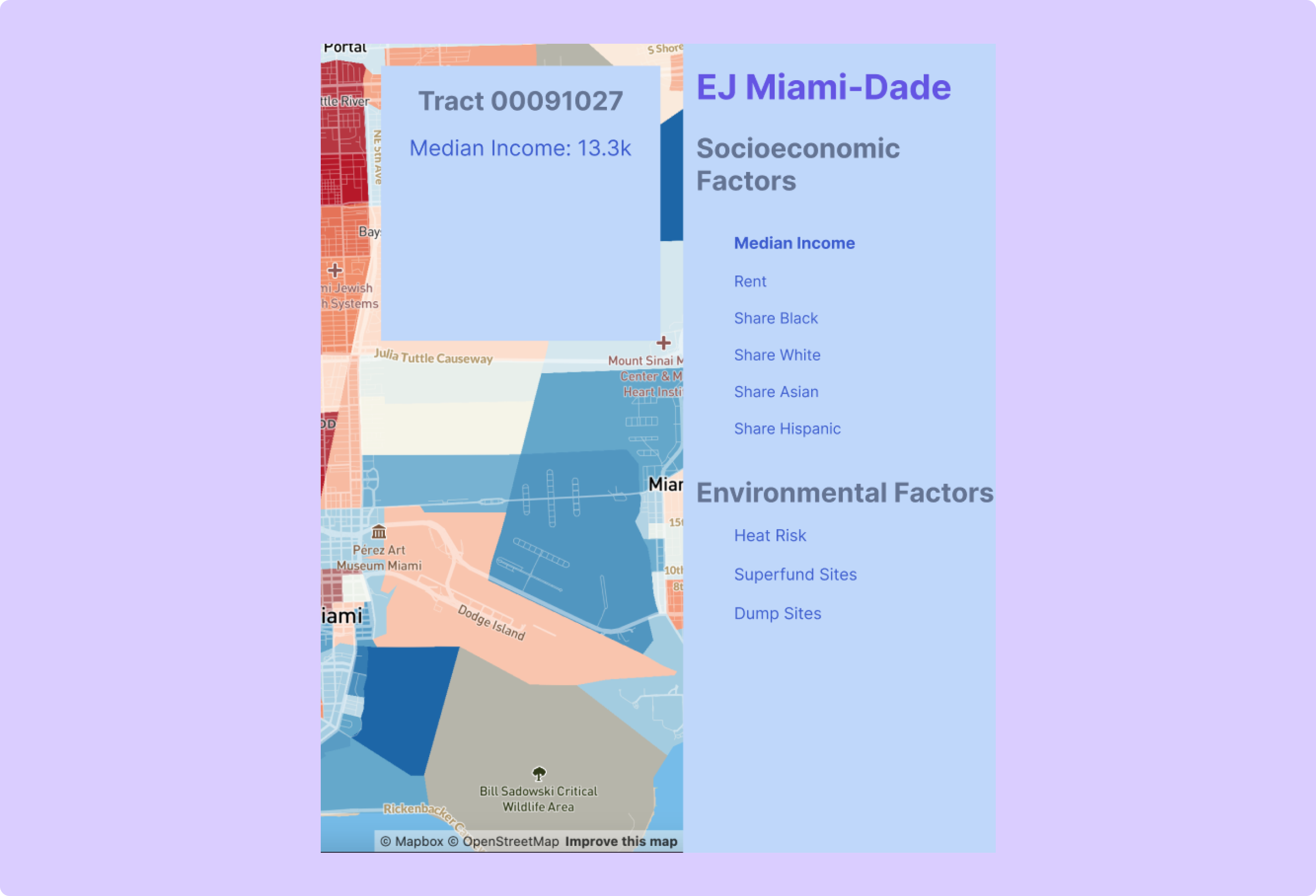
(original)
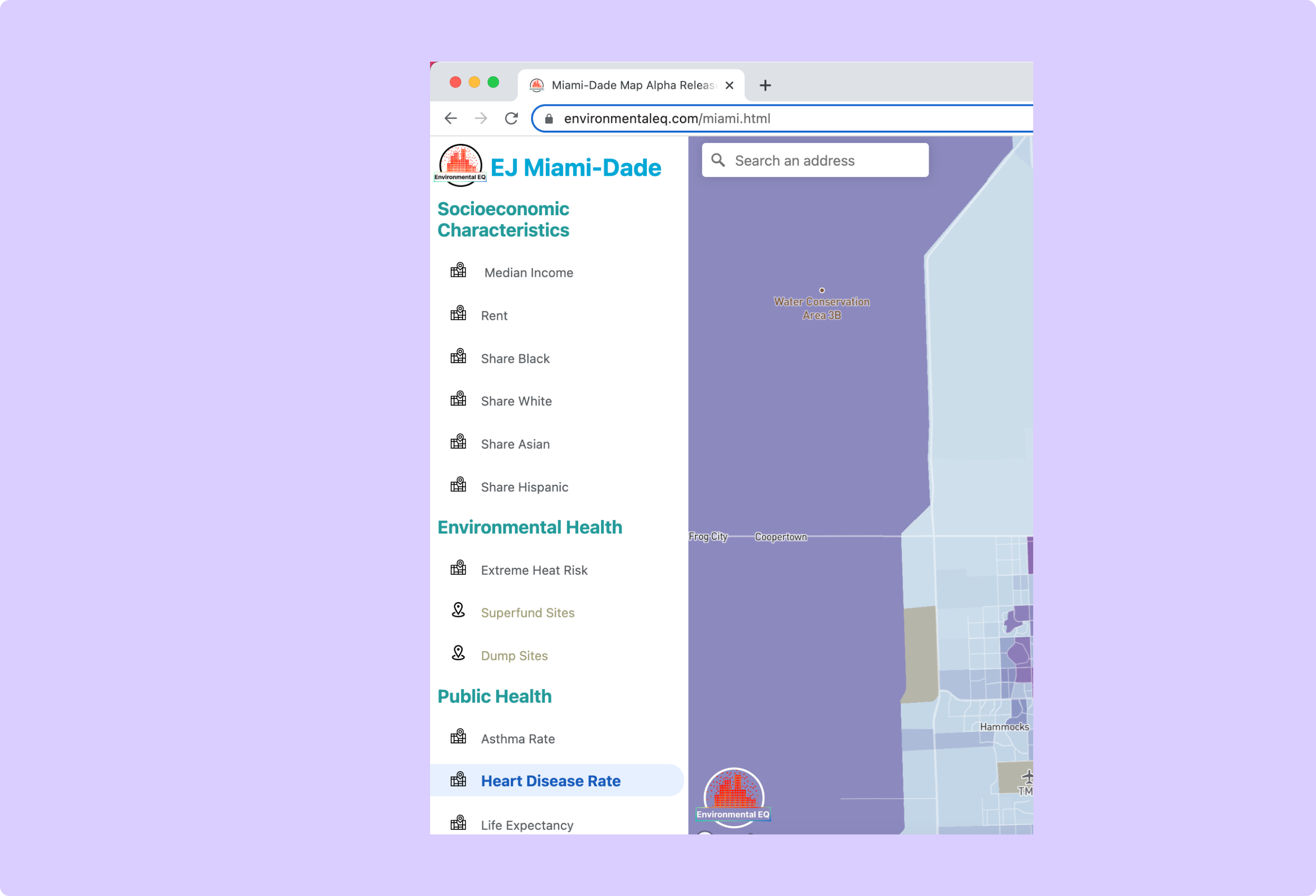
(final)
Stage: (4) Feedback on mockups
Change: Moved the side panel from the left side of the screen to the right.
Rationale and Alternatives: Users interacting with the hi-fi mockup of the product preferred the panel on the left side of the screen to the right. One user articulated that they were more used to map panels being on the left, like with Google Maps. This suggestion made sense as most people that have used interactive maps have a mental model of a panel on the left side of the map.
Sidebar Design
(original)
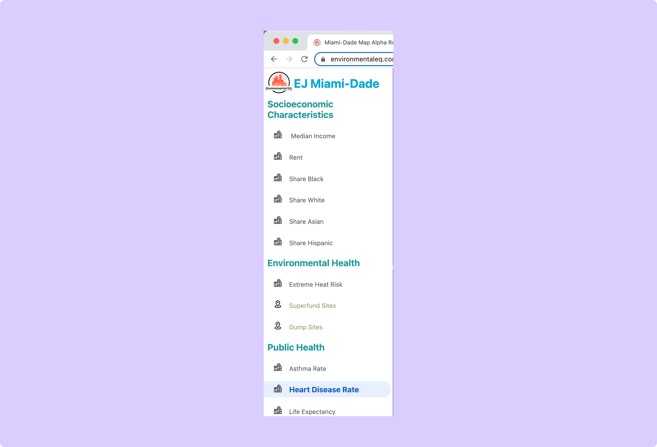
(final)
Stage: (4) Feedback on mockups
Change: Switched the style of the side panel to a white background with blue, green, and black text.
Rationale and Alternatives: Users hated the blue color scheme and other dark color schemes a lot. When shown many different potential color schemes the white one performed the best by far.
Map Design
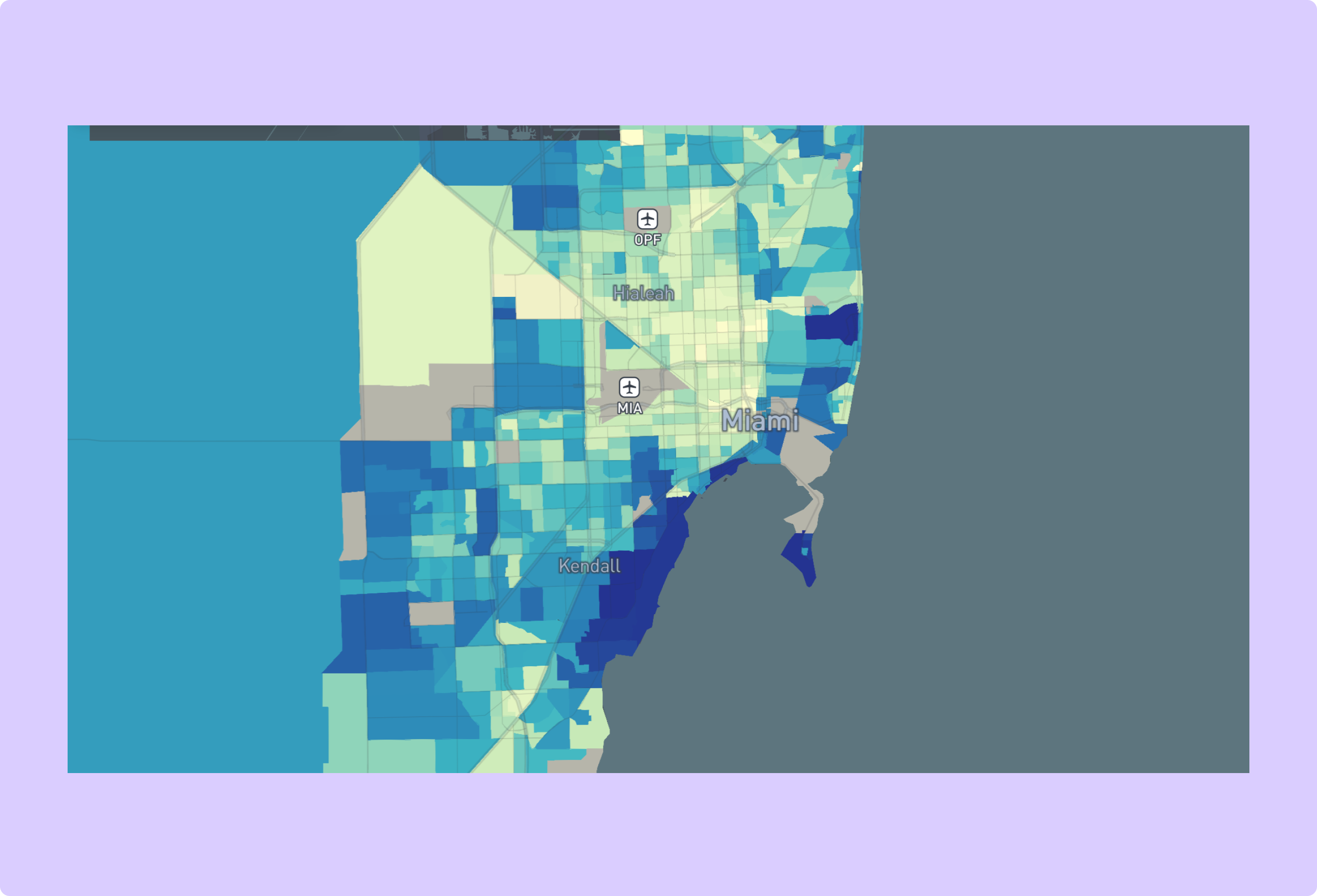
(original)
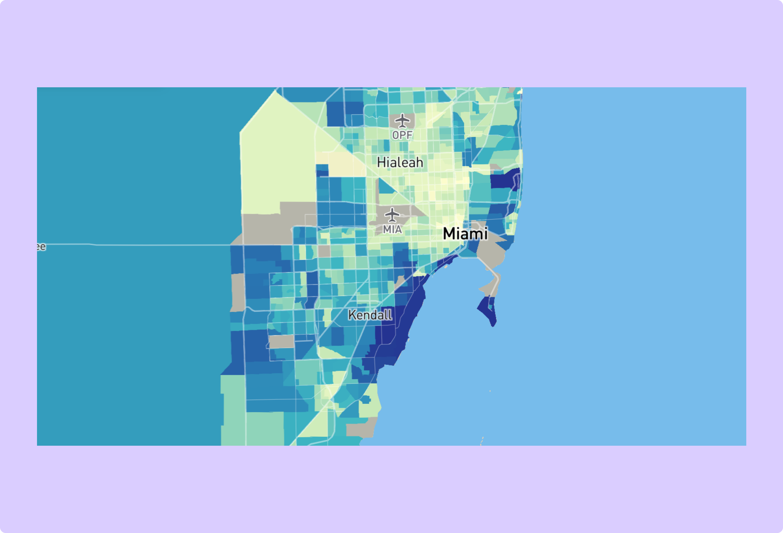
(final)
Stage: (4) Feedback on mockups
Change: Used a light map style instead of a dark one
Rationale and Alternatives: When shown a light and dark version of the map, all people prefered the light version, as with the sidebar.
Toggle Button Design
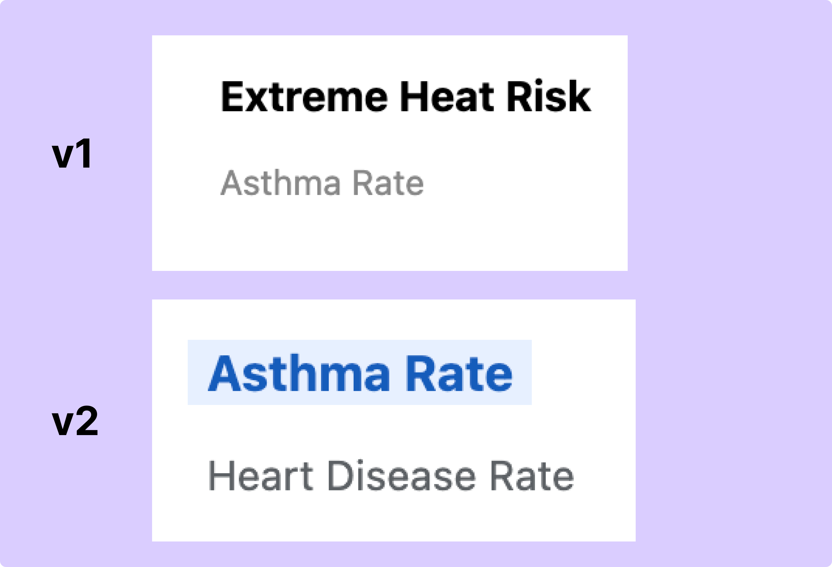
(original)
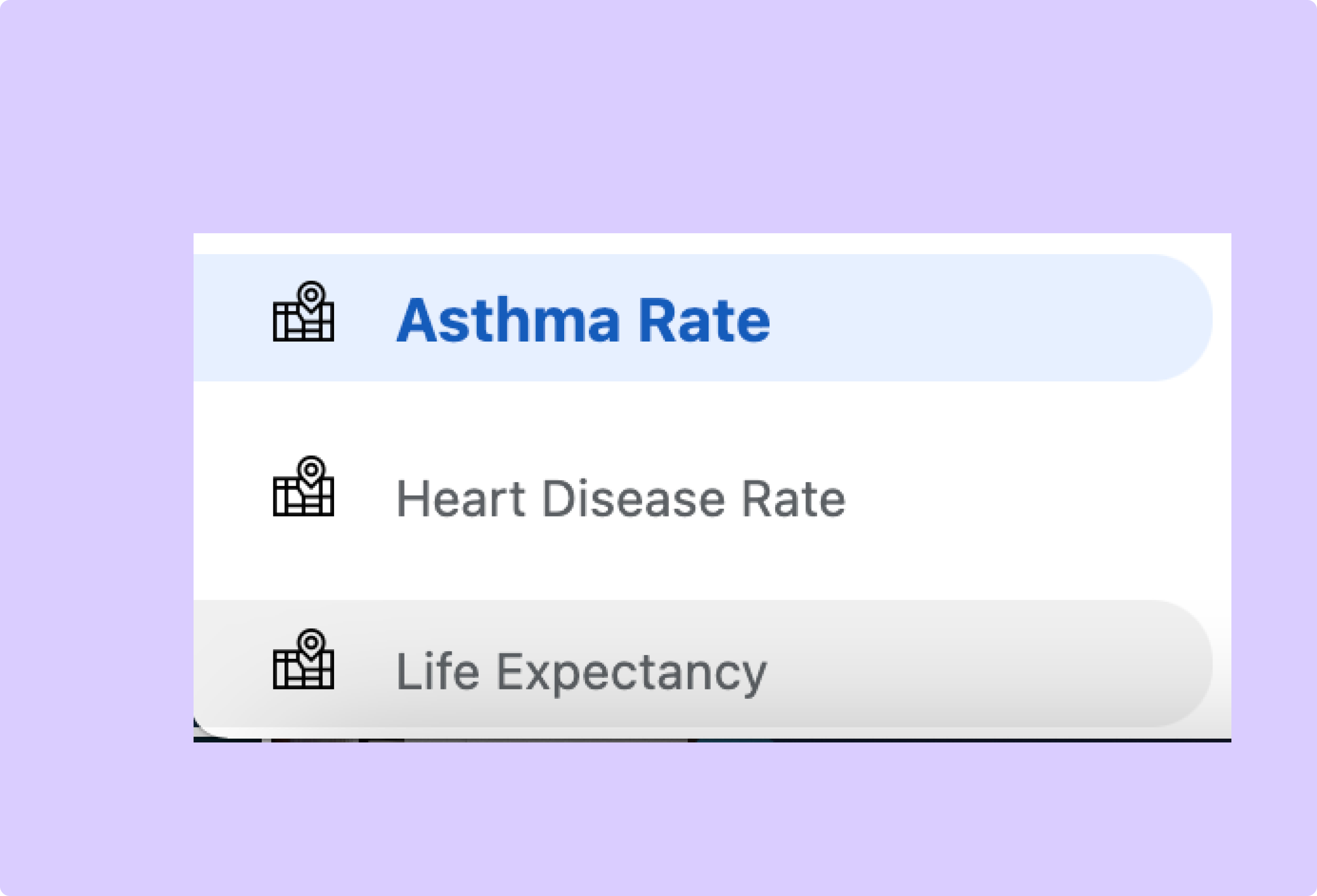
(final)
Stage: (6) User testing and feedback from community partners at UMiami
Change: Added affordances to layer toggle buttons including a blue outline on selection and a gray outline and cursor switch to a pointer on hover.
Rationale and Alternatives: In user testing it became obvious that the simple bold and normal button styles did not make it clear to users that they could switch between layers. The final design includes affordances to make the functionality more intuitive.
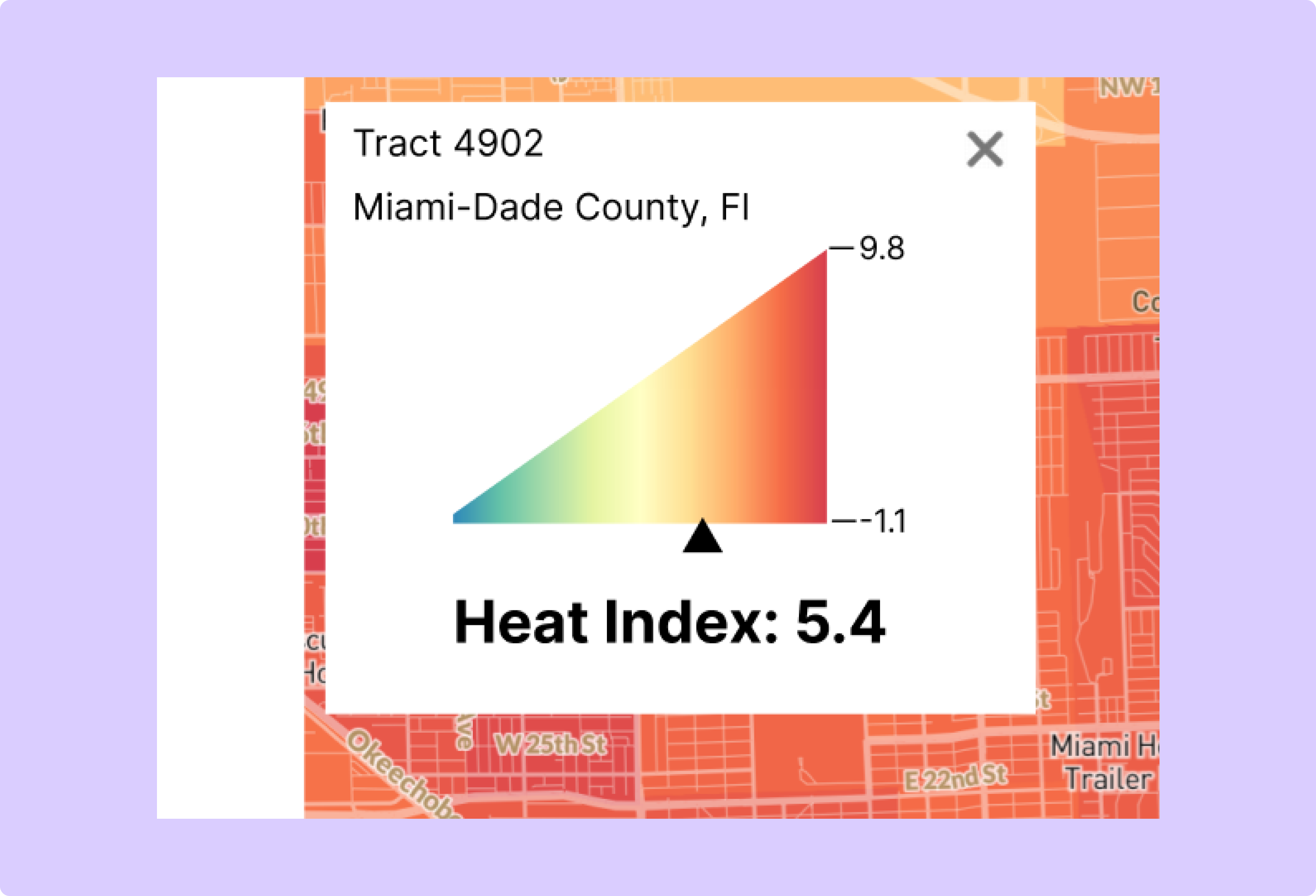
Popup Style
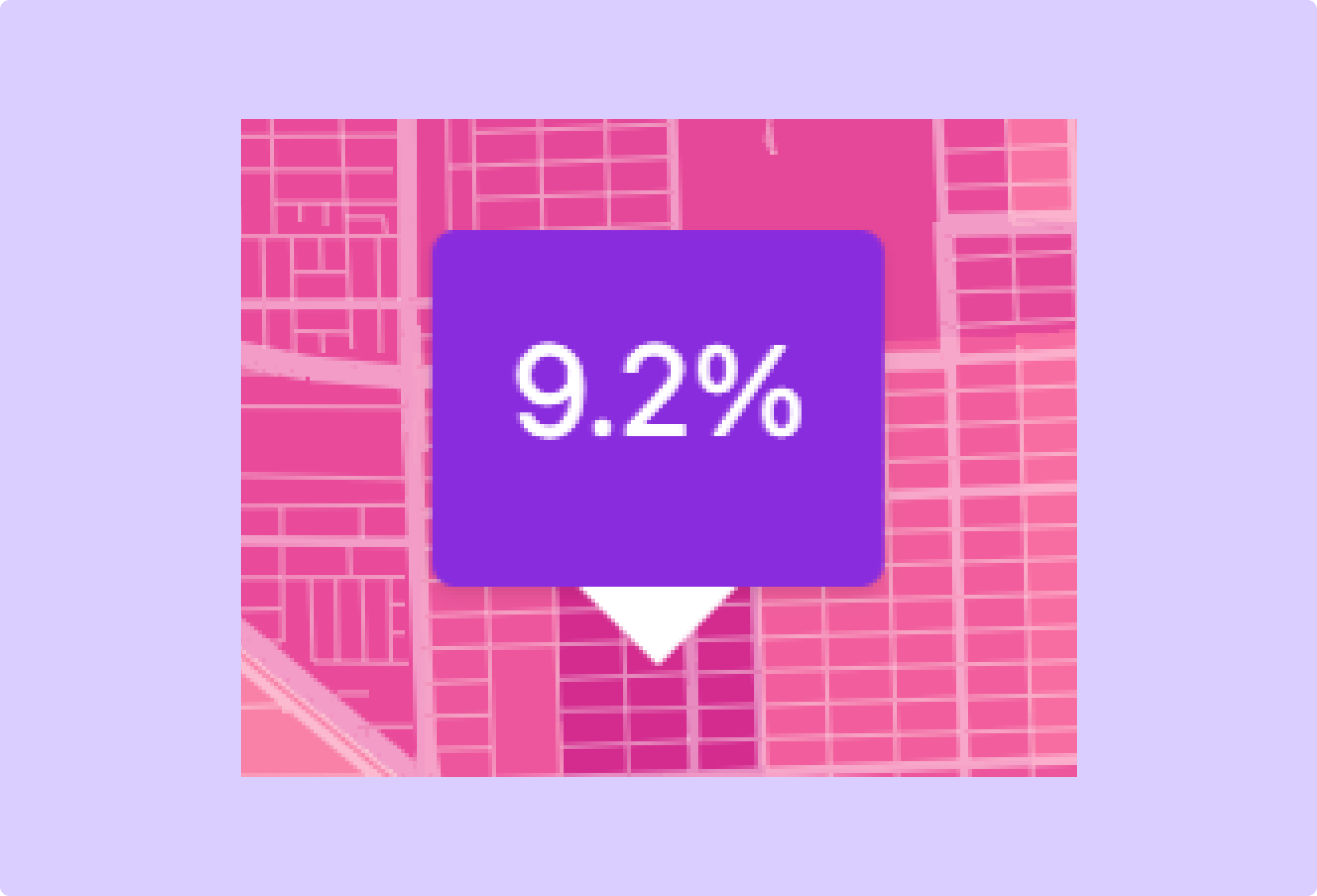
(original)
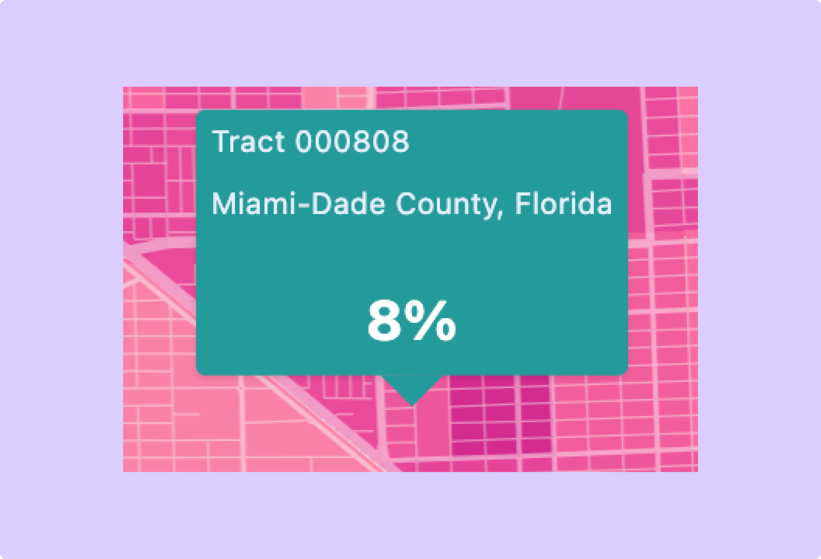
(final)
Stage: (6) User testing and feedback from community partners at UMiami
Change: Added more information to the popup including census tract and county information.
Rationale and Alternatives: Community partners suggested including more location-specific information on the popups. Feedback made sense as this served on of the primary goals of the map to allow users to explore factors in their specific neighborhood.
Outline Style
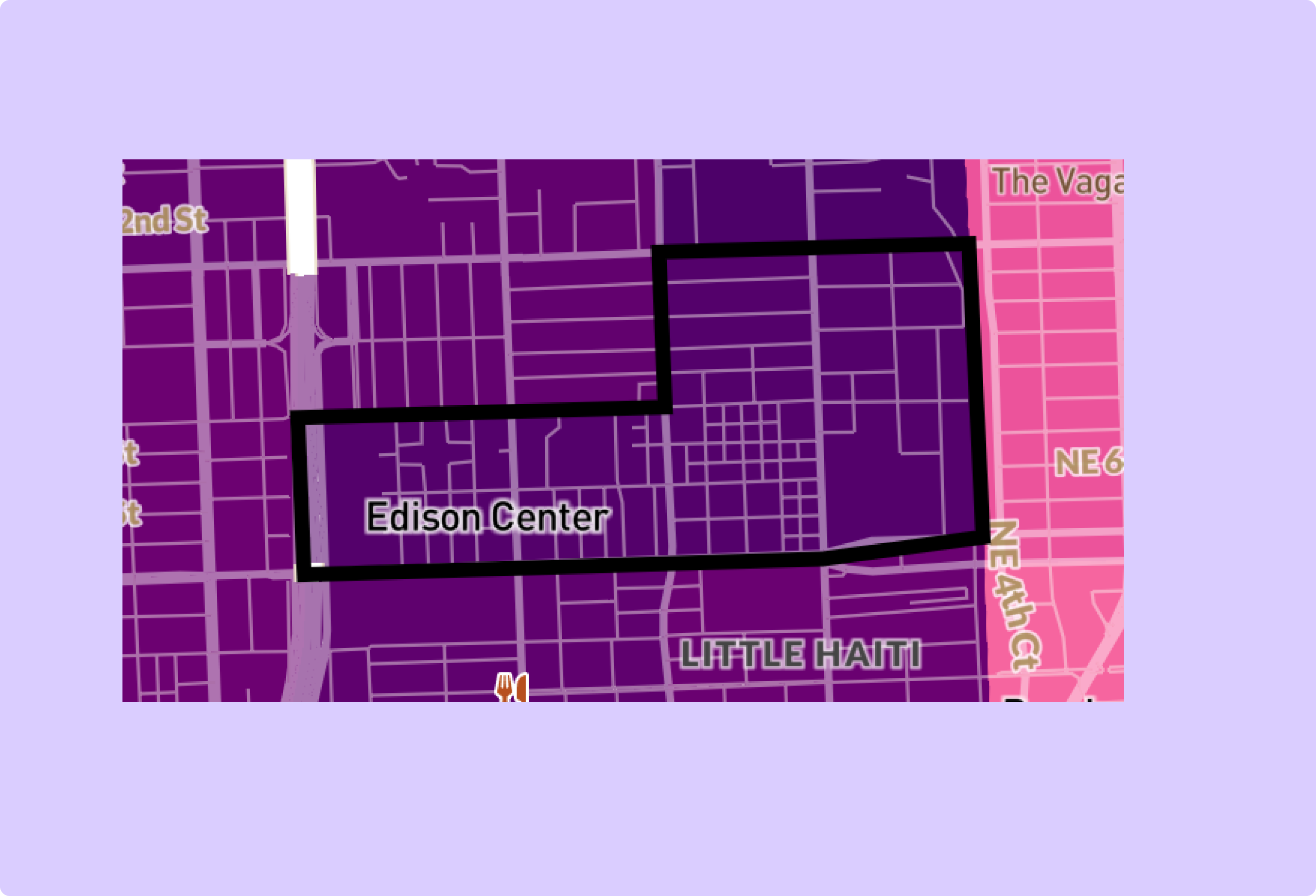
(original)
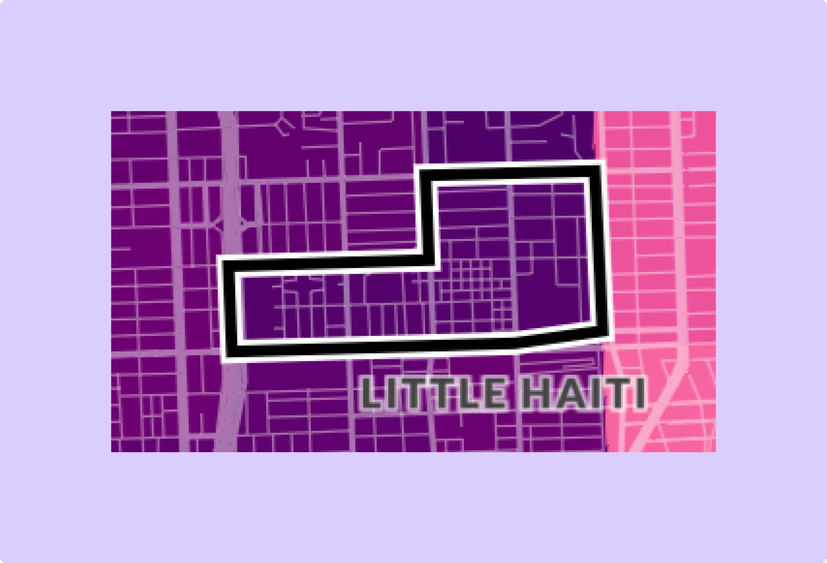
(final)
Stage: (6) User testing and feedback from community partners at UMiami
Change: Switch outline from black to white and black.
Rationale and Alternatives: In the first release of the map, it was sometimes difficult to see the outline when it was one tracts with darker colors. This adjustment makes it visible on tracts of all colors.
Point Style
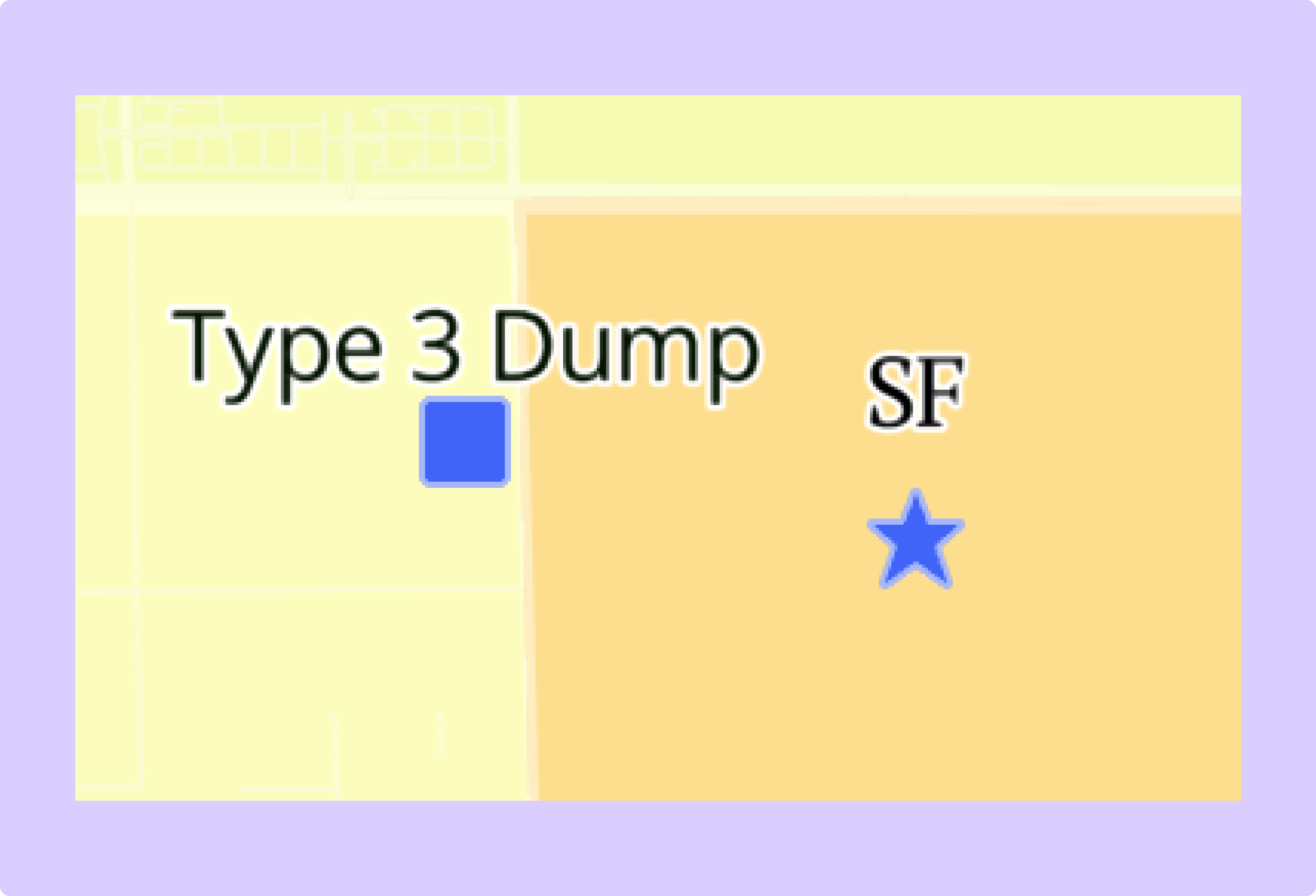
(original)
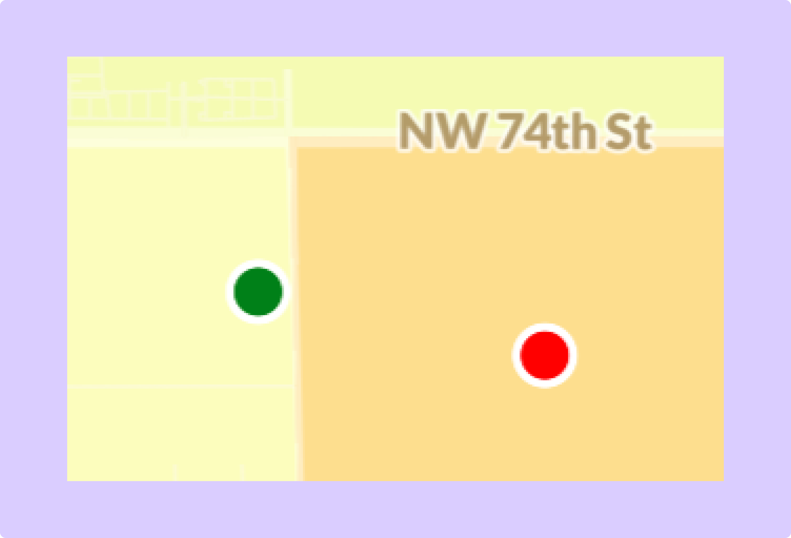
(final)
Stage: (6) User testing and feedback from community partners at UMiami
Change: Removed labels from points and changed colors
Rationale and Alternatives: Users complained when testing that the text on the points often made the screen unnecessarily crowded. Switching to a simpler design addresses this issue.