Identifying Issues
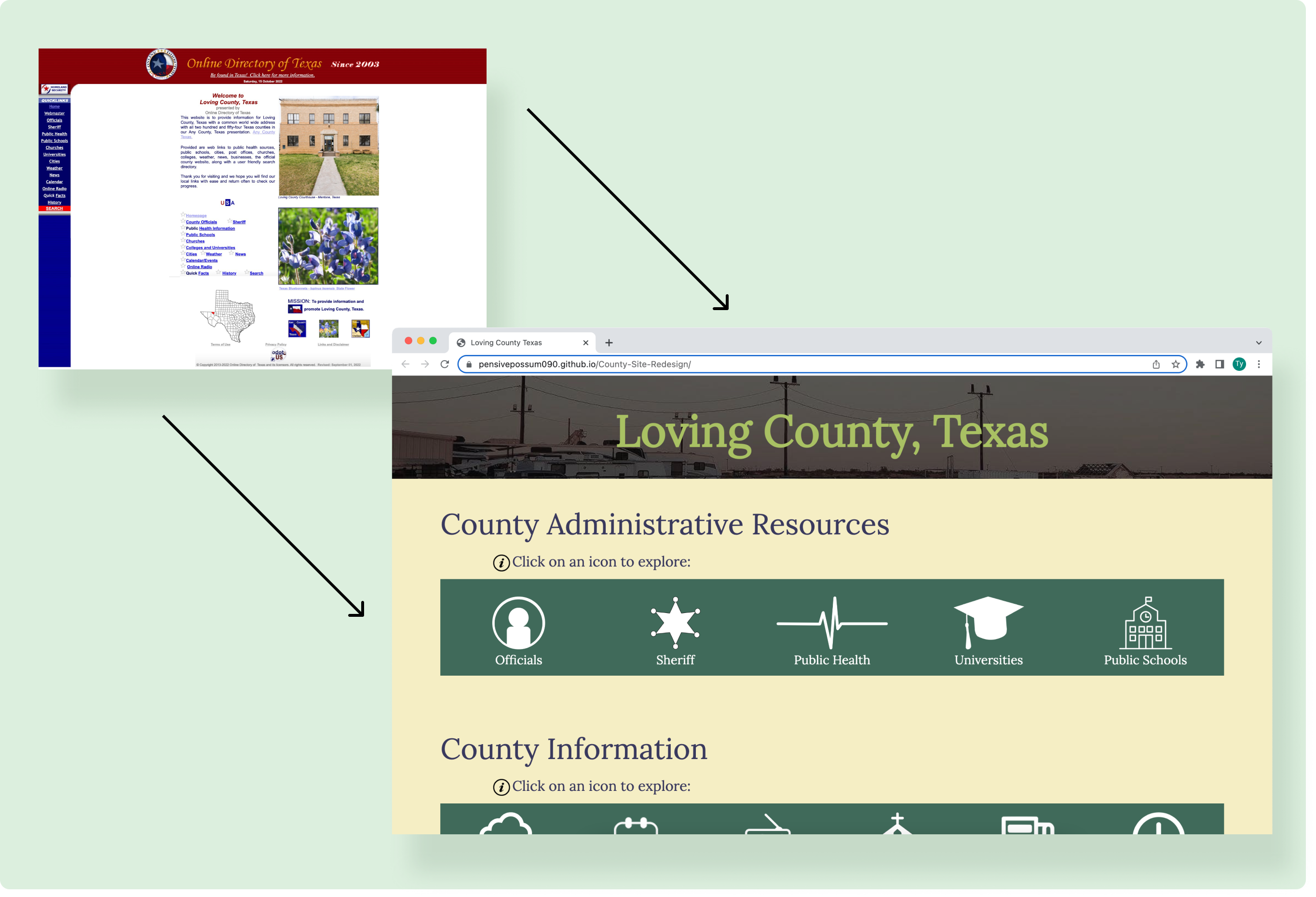
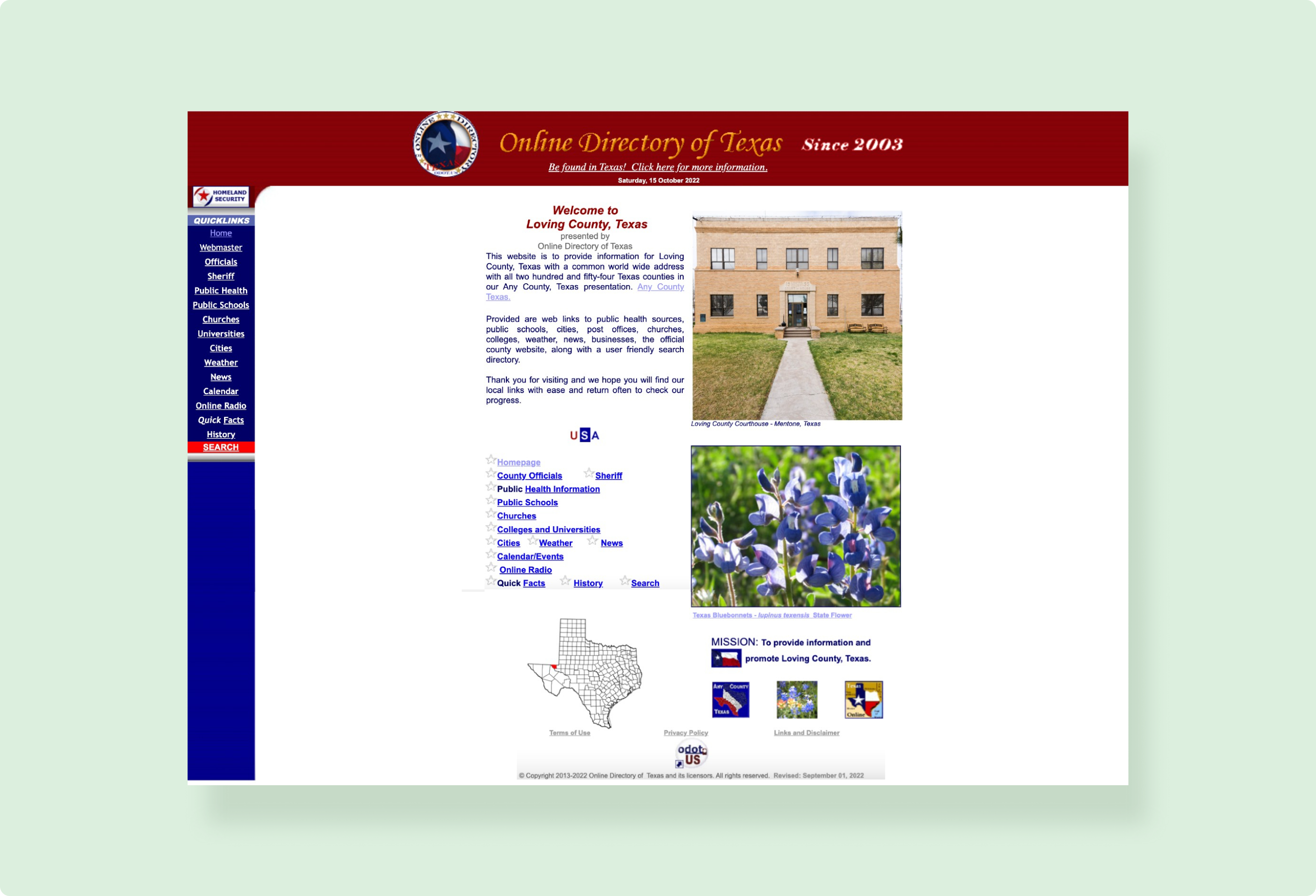
Original Website
The Loving County website was created to direct residents and visitors towards the small county's resources and general information including administrative contacts, the weather, and quick facts about the county.
Problems with the Original Website
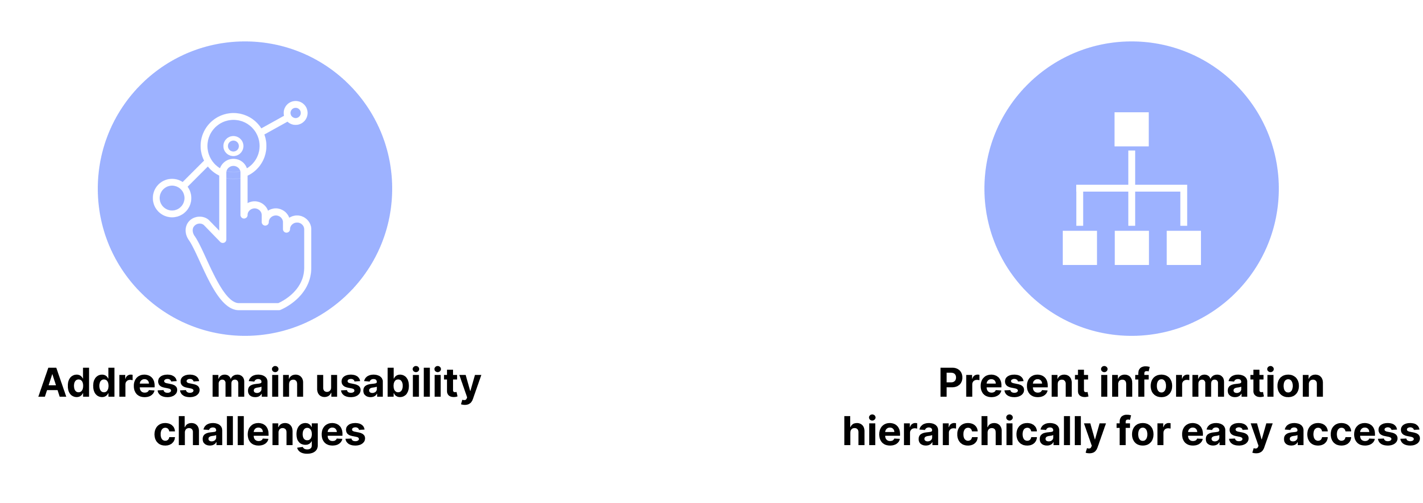
The original website has a number of usability and accessibility issues. Generally, there isn’t a clear hierarchy, intuitive affordances, or a proper site structure. These specific issues can be seen below:
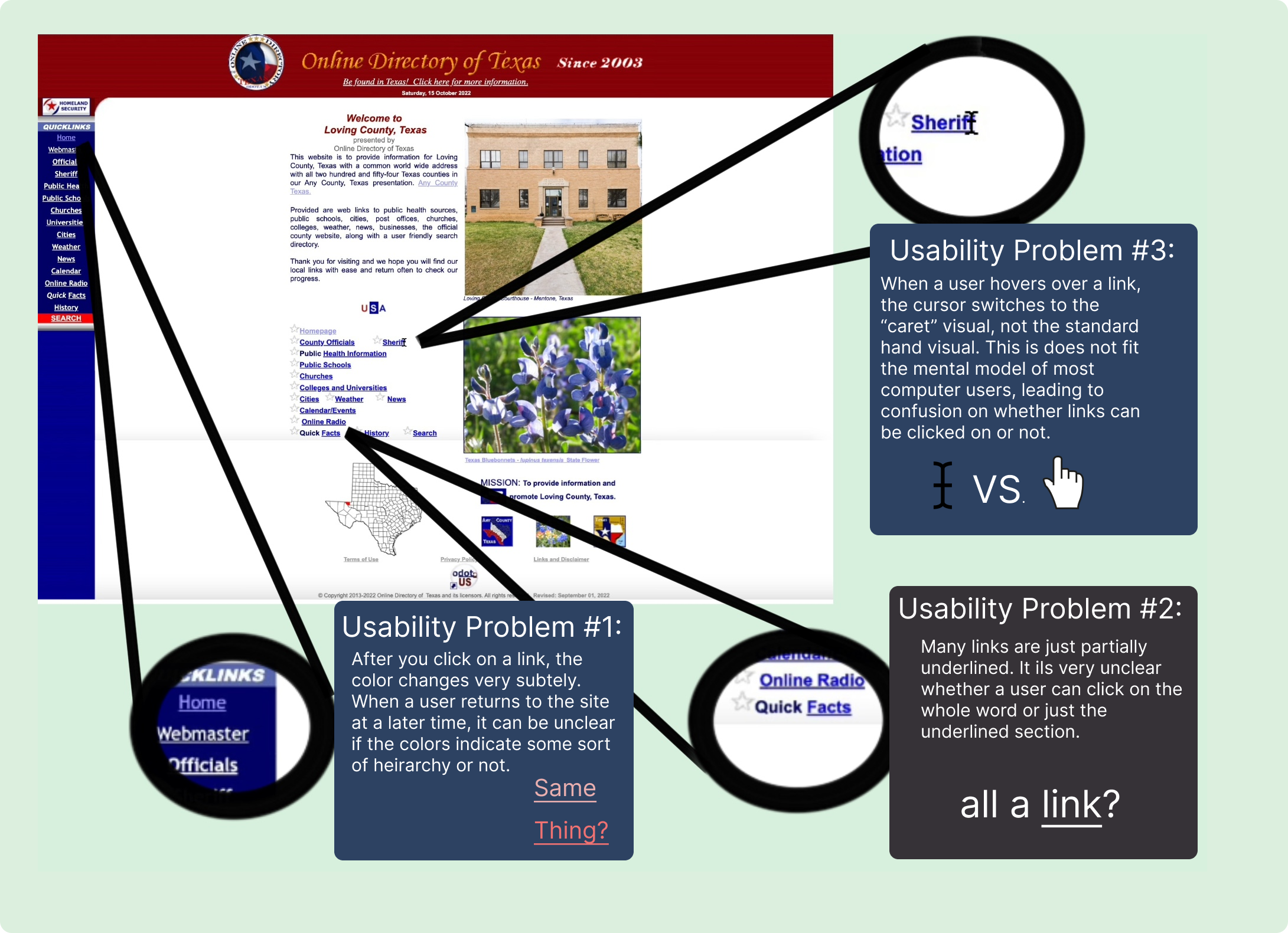
Usability Issues:
(hover to zoom)
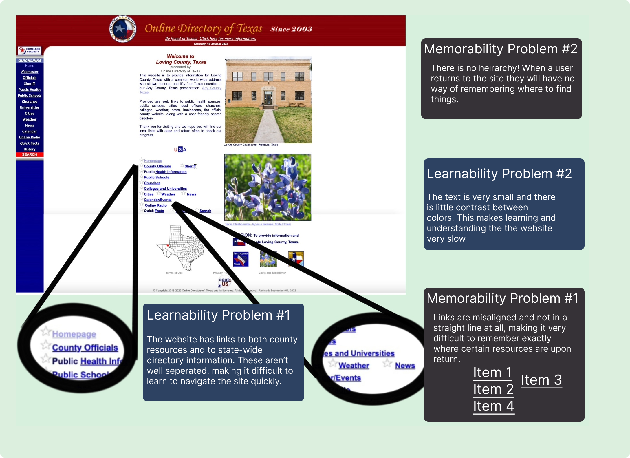
Learnability Issues:
(hover to zoom)
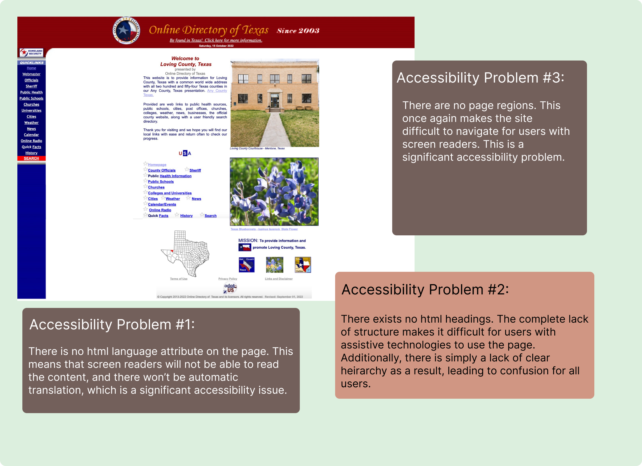
Accessability Issues:
(hover to zoom)
Design Process
This project was very time constrained with only two weeks to complete. As a result there wasn't time to set up much feedback and testing. Still, I tried to prototype and make adjustments at each stage to determine what is effective. This was the total process with which I made the redesigned site:
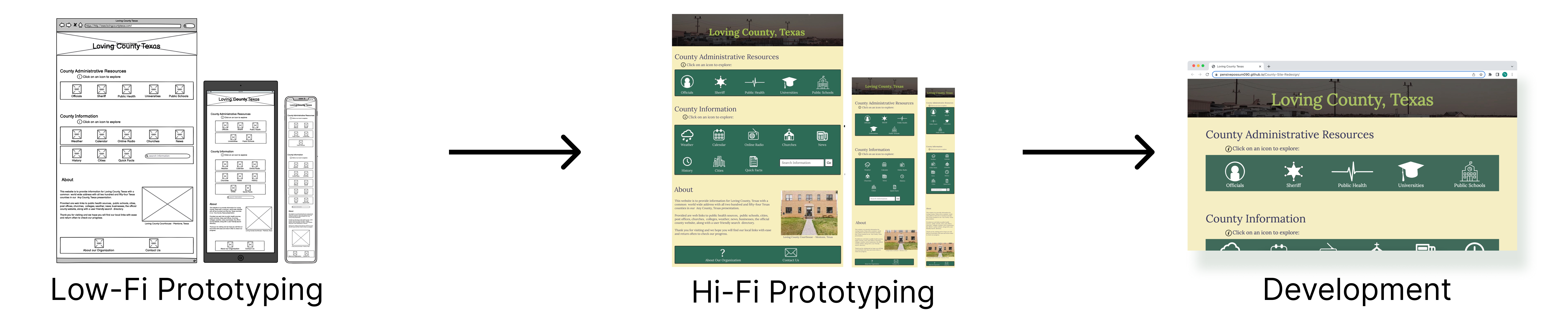
Low-Fidelity Prototyping
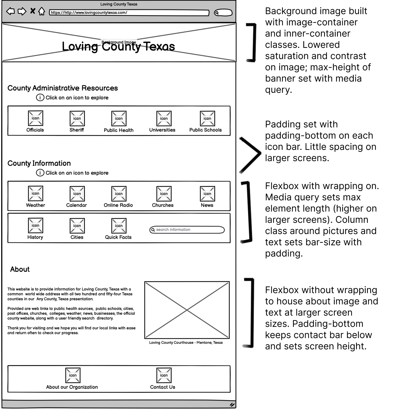
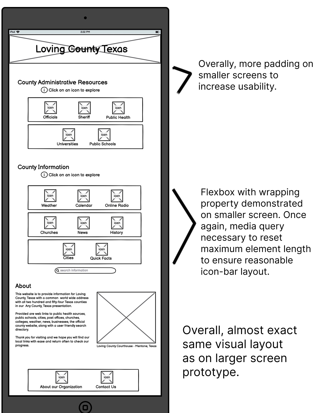
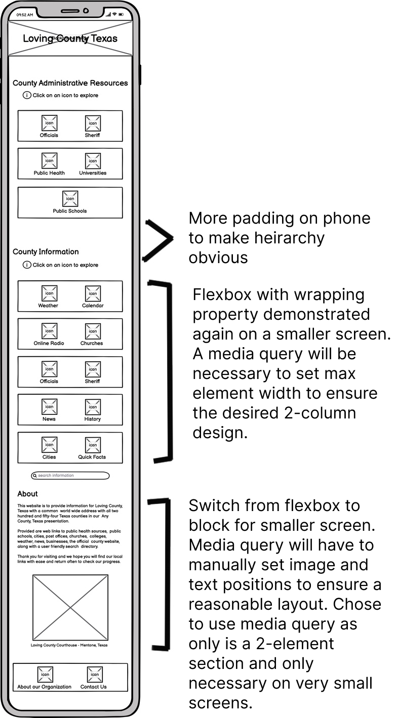
I began developing a design by thinking about how to address the key usability issues with the original site. The wireframes below show how I first thought about developing a clear heirarchy and intuitive interface on different screen sizes. I thought the best way to address the challenges with the original site would be to clearly organize the resources into categories and include icons to help users. The wireframes I ultimately developed, with development annotation included, can be seen here:
Desktop:
(hover to zoom)
Tablet:
(hover to zoom)
Phone:
(hover to zoom)
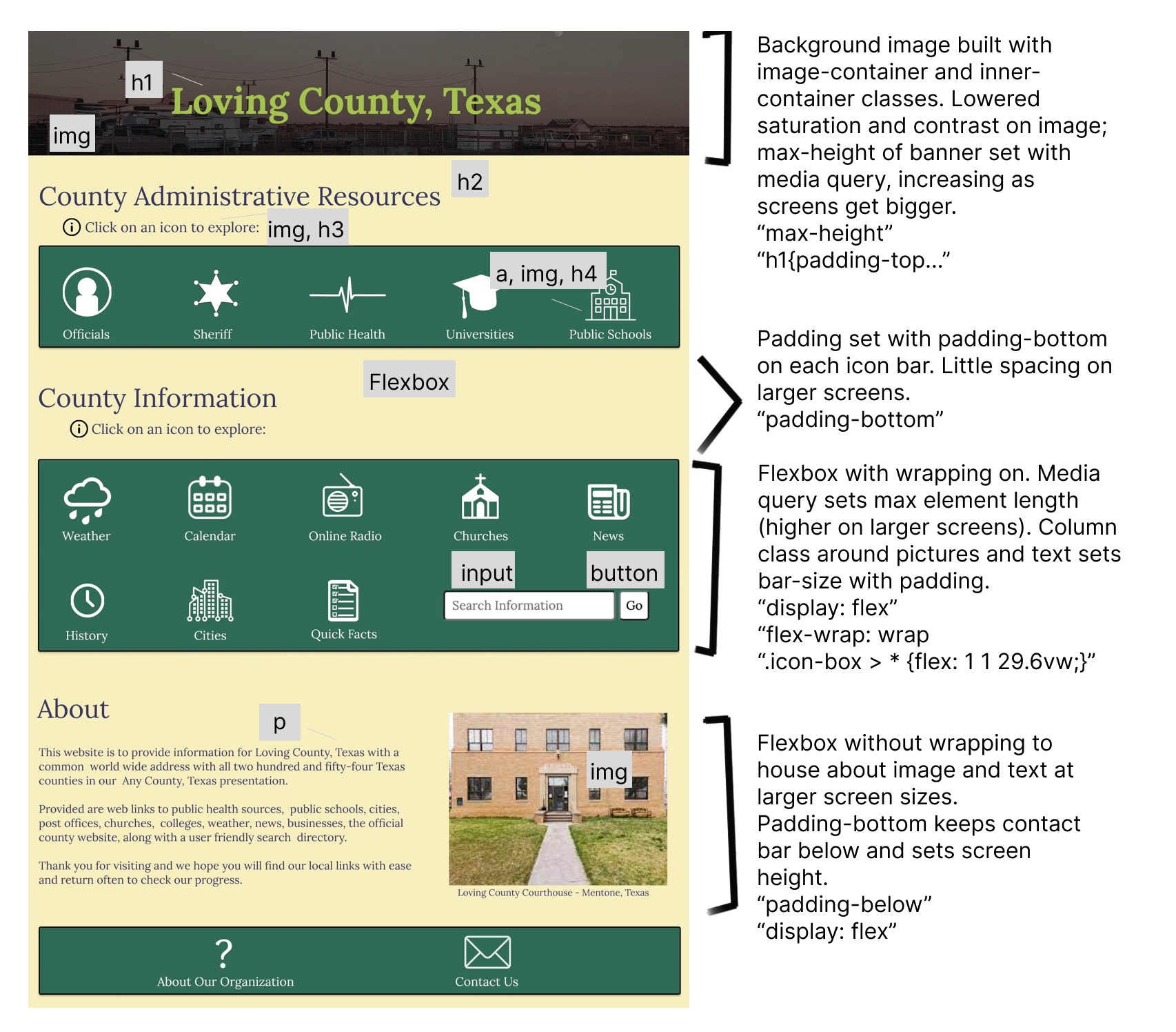
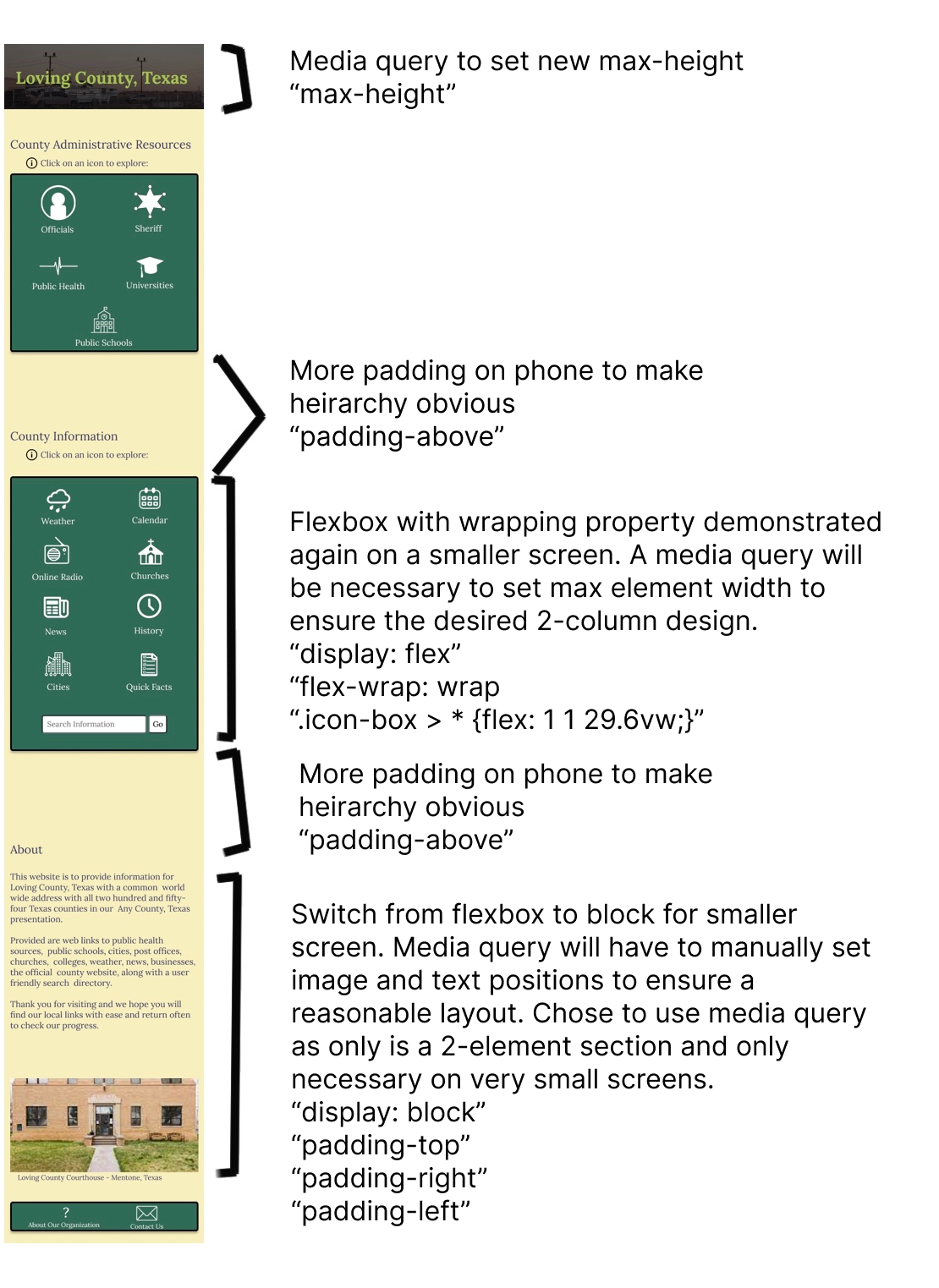
High-Fidelity Prototyping
After developing the low fidelity prototypes, I looked at what I liked about the design and made a few tweaks before creating hi-fi prototypes in Figma. Specifically, I thought to shift some of the icons to a different row as this would be more intuitive, and chose to have the icons change color on hover so users would know that they could click on them. Finally, I picked a color scheme which I thought fit well with the project theme and helped in establishing the heirarchy. The annotated hi-fi prototypes can be seen here:
Desktop:
(hover to zoom)
Tablet:
(hover to zoom)
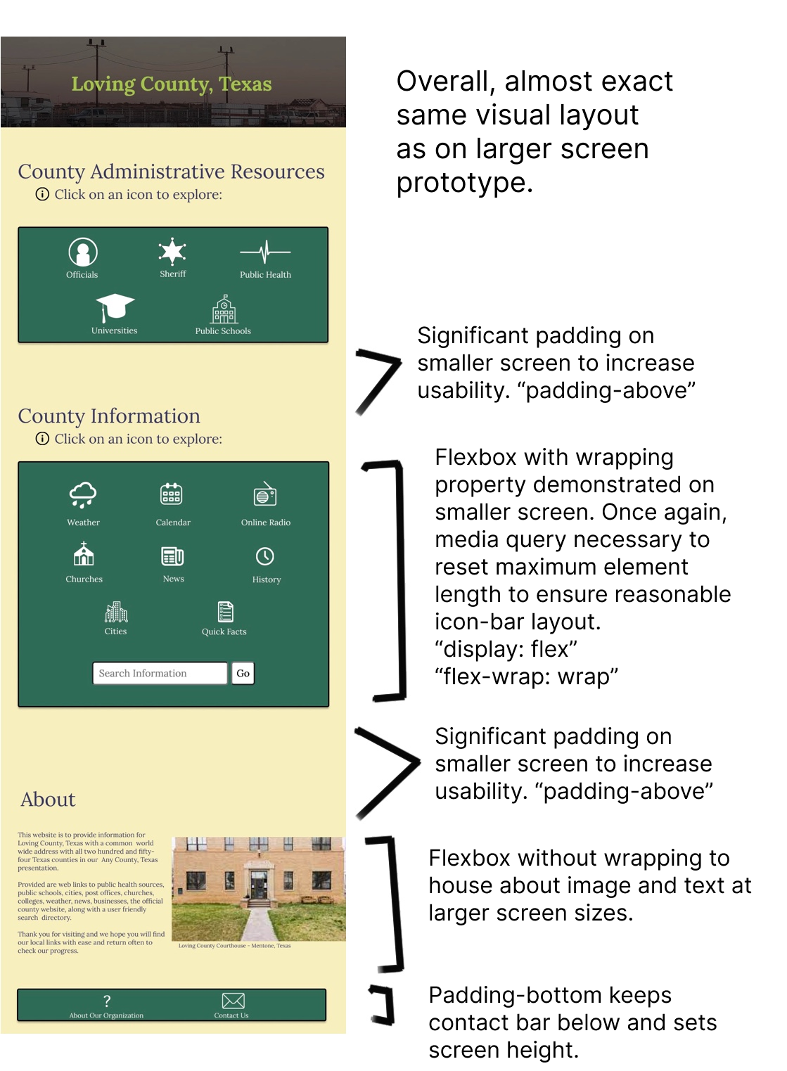
Phone:
(hover to zoom)
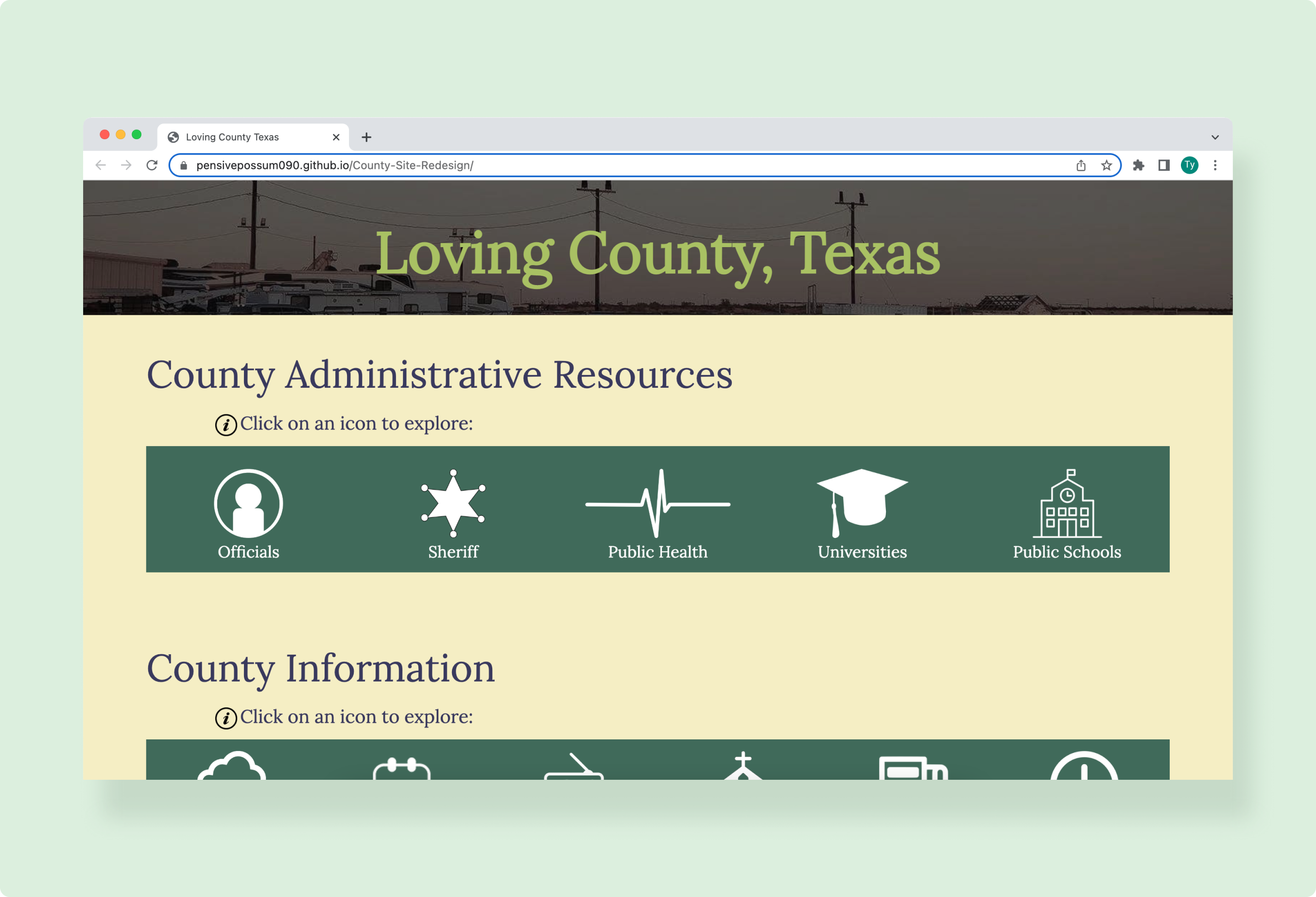
From the hi-fi prototypes, I developed the final design for the website which can be explored here. The site design (which does not have working links) maintains an intuitive display, and is an exact copy of the hi-fi prototypes.
Don't cut corners when developing. This was one of my first ever development projects and I really struggled. I wasted a lot of time doing rather trivial things and reading very basic documentation (the learning process, I suppose). Constantly, I found myself tempted to cut corners or change the design to make development easier. I realize this is a constant challenge when designing and developing, and this project highlighted for me the need to stay honest to produce the best product by compartmentalizing the design and development processes.