Design Process
This was the process with which we made our final design:
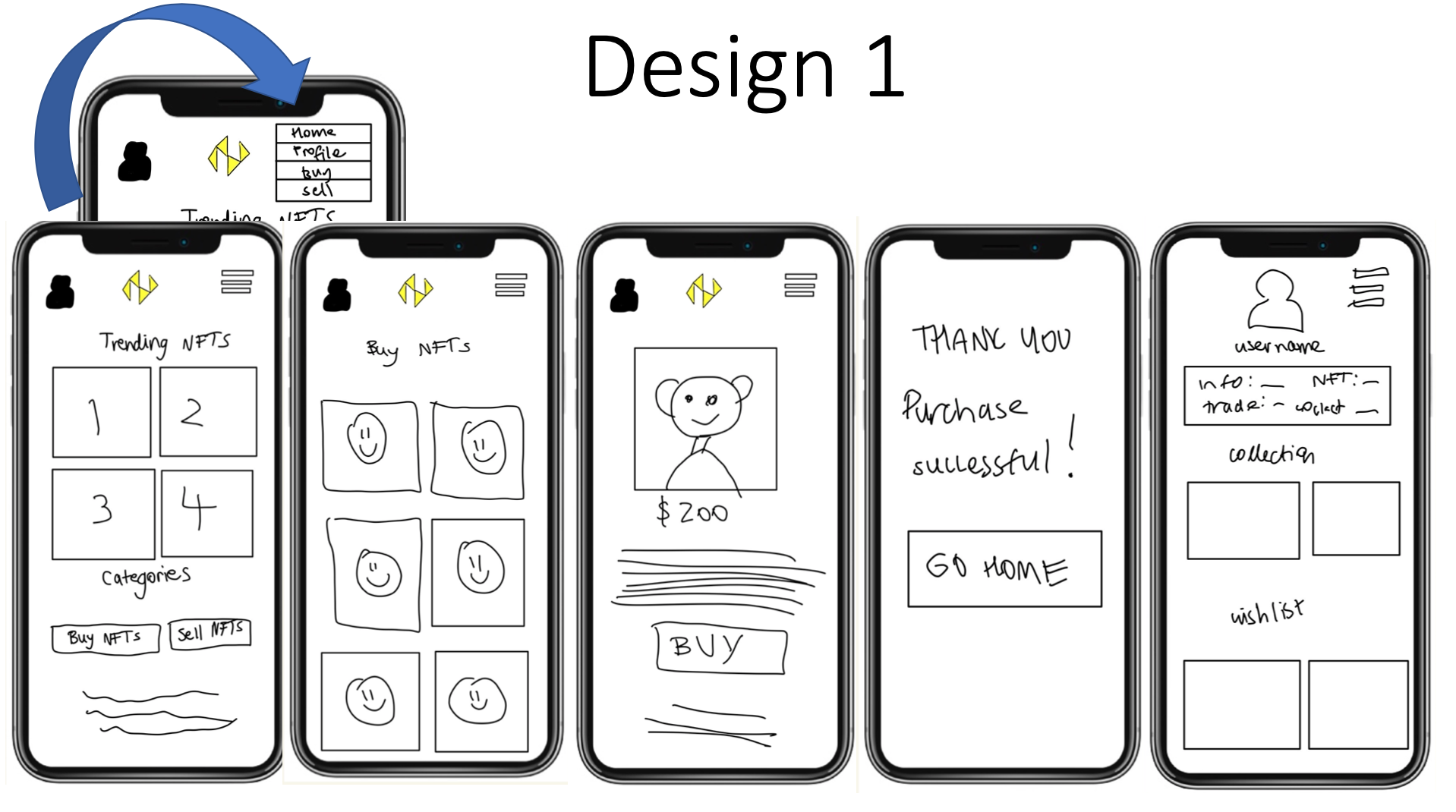
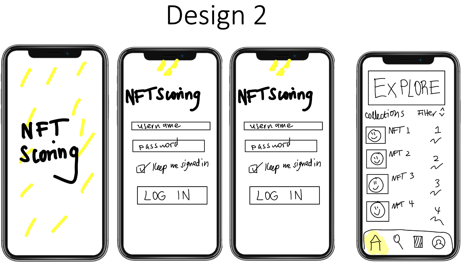
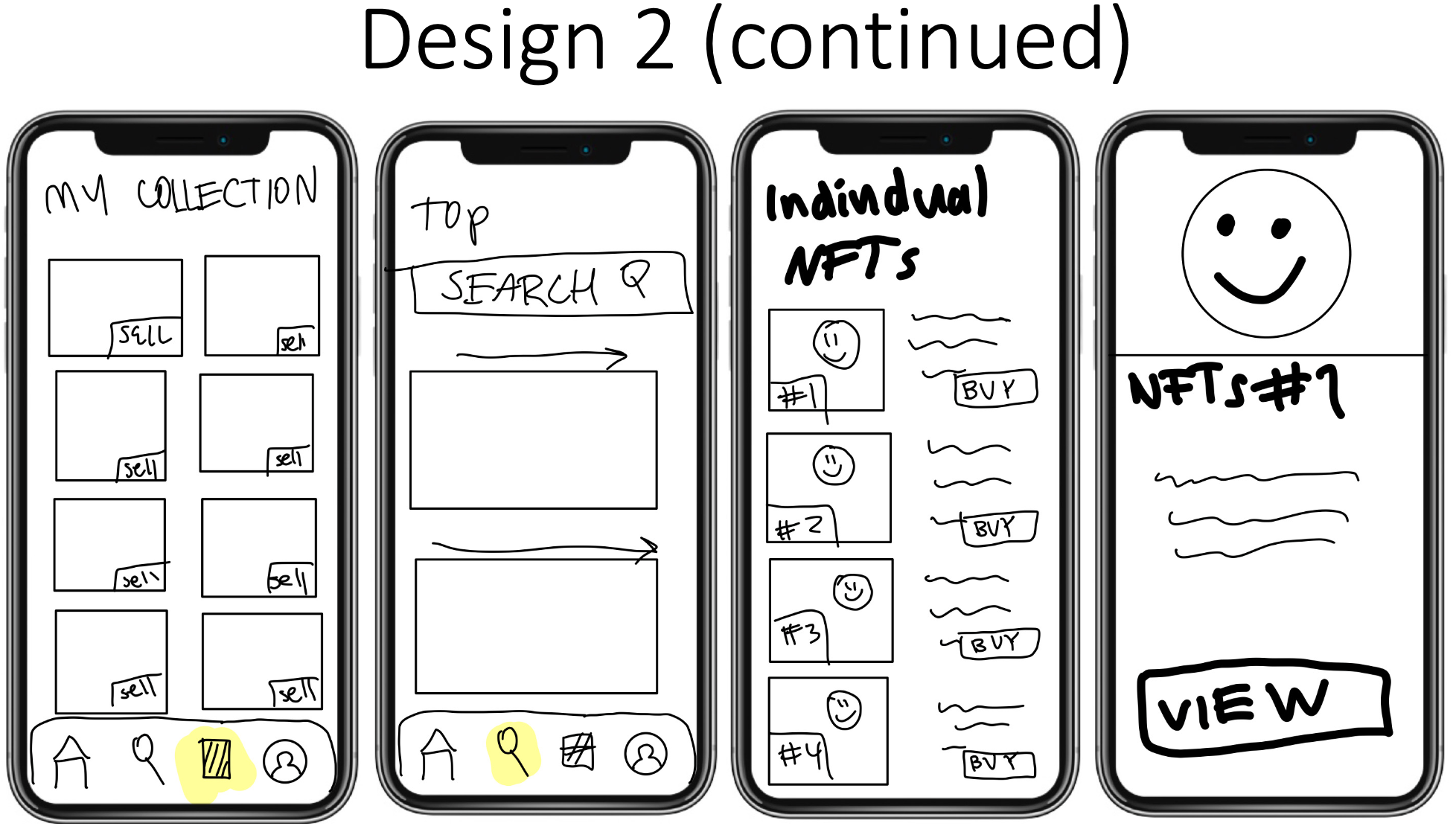
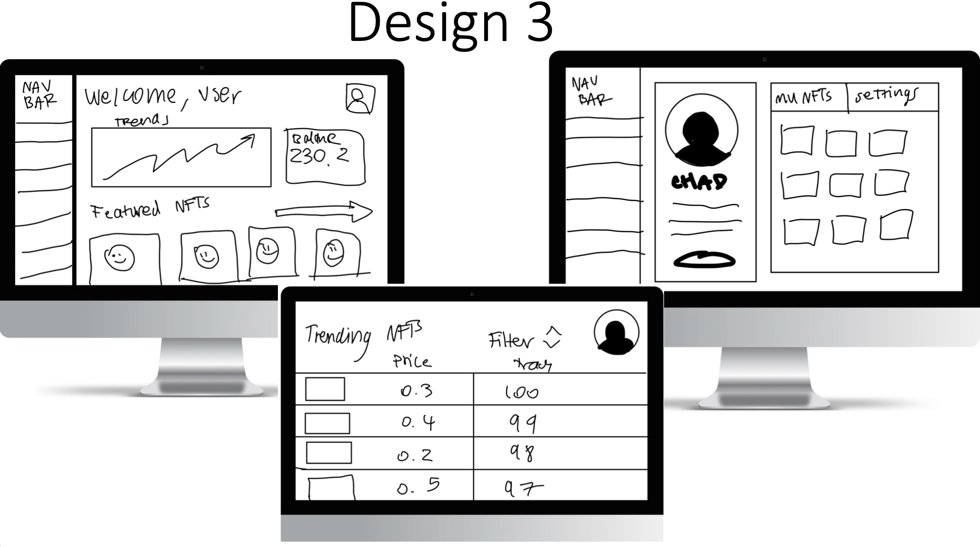
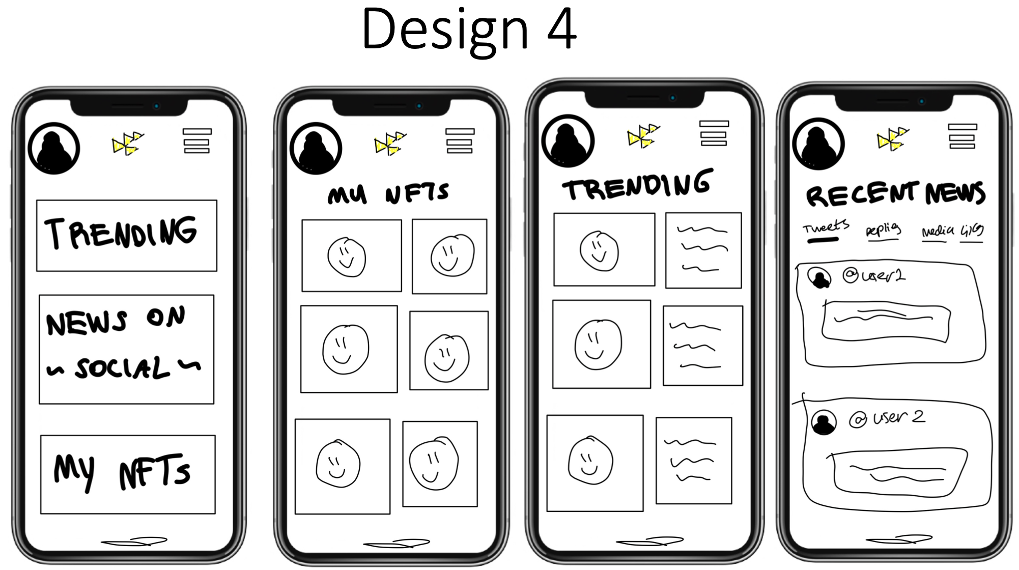
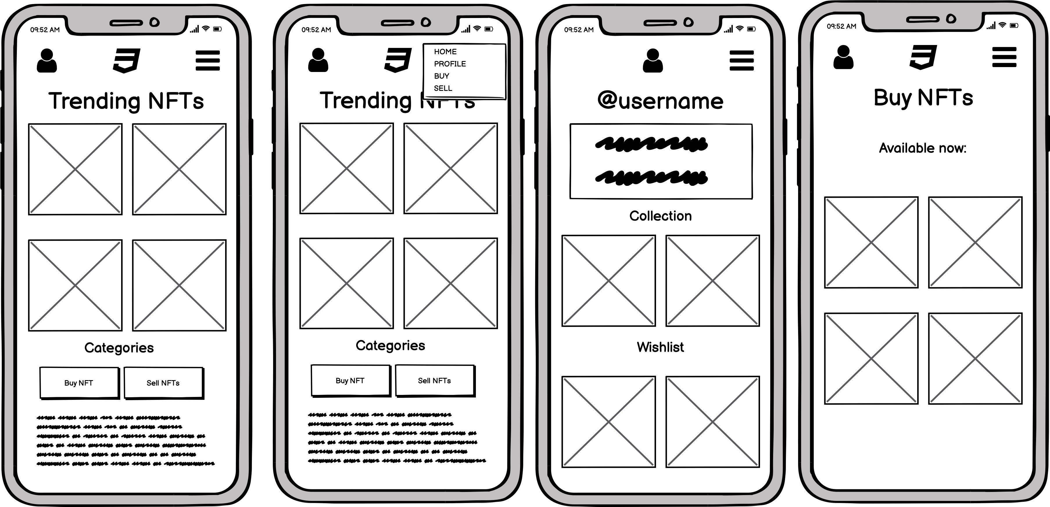
From our sketches we developed wireframes that we would base our interactive prototypes on. We took components from a number of sketches, including navigation from sketches 1 and 4, the trending page from sketch 1, and the collection page style from 2. These were the wireframes that we developed:
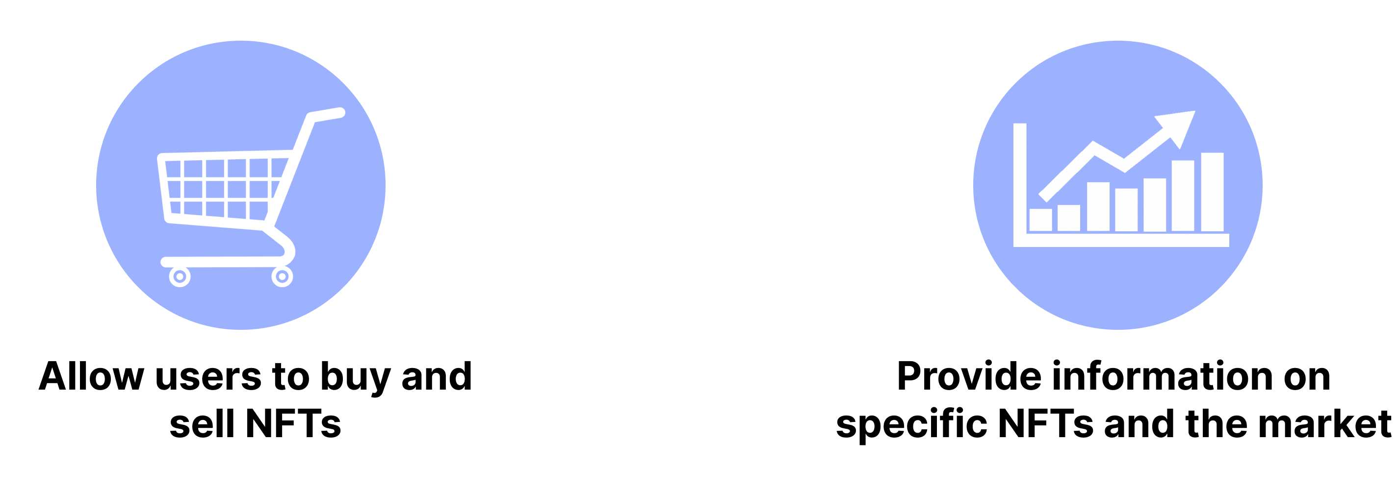
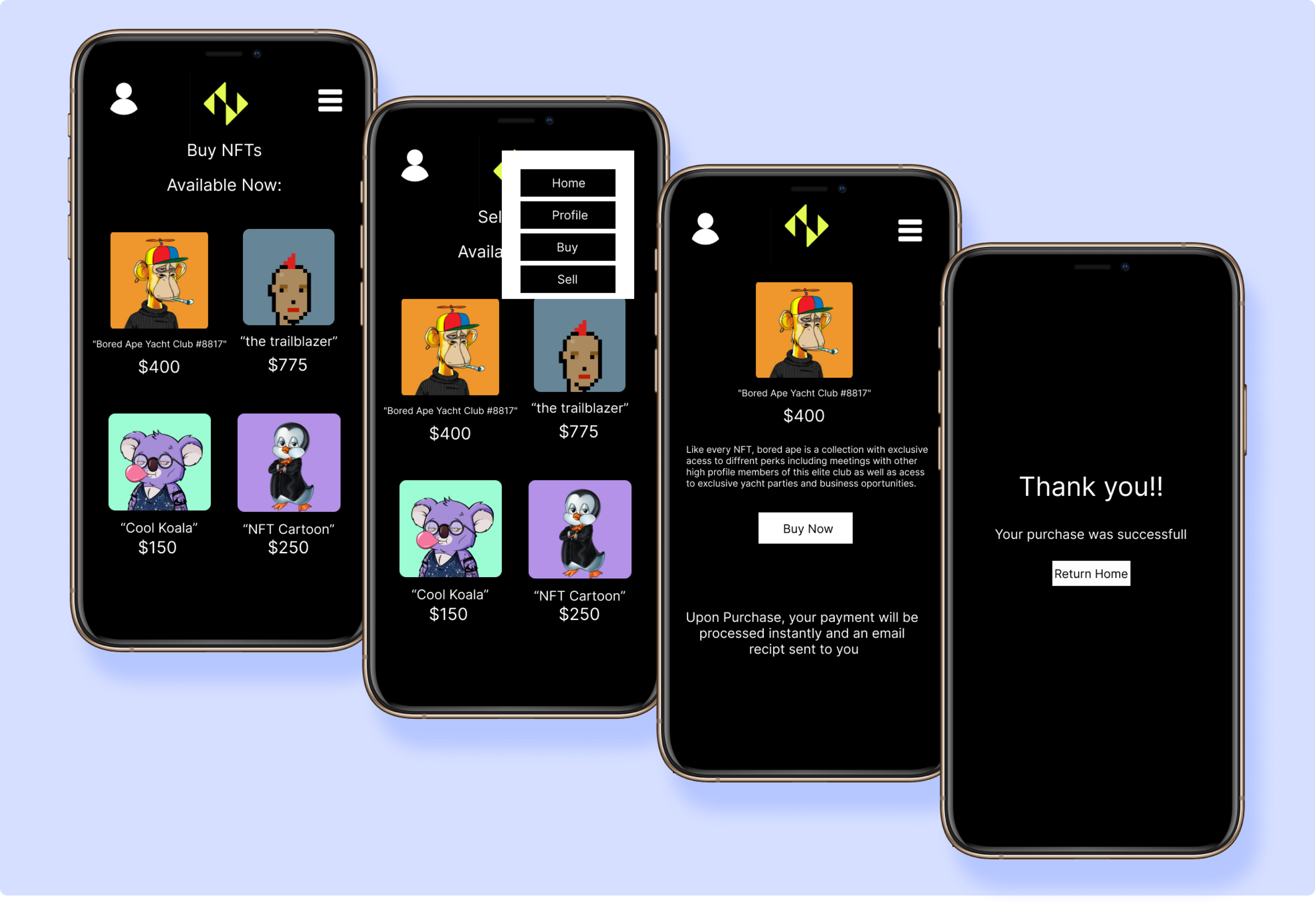
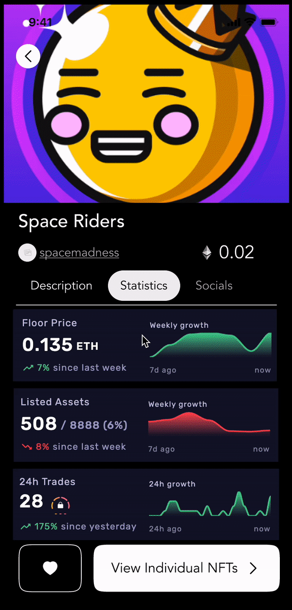
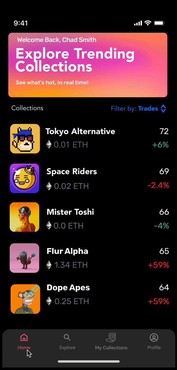
From our mockup, we developed a hi-fi interactive prototype using figma. The prototype allows users to view, buy, and sell NFTs as well as view their profile.
We then gave our prototype to a group of about 25 of our peers for critique. The group interacted with it, then gave us the following criticisms and advice:
- 1) The design doesn’t carry out the goals of the startup to allow investors to make intelligent decisions. It is just a marketplace.
- 2) The design would benefit from a greater emphasis on trends and analytics.
- 3) The buy and sell pages look too similar.
- 4) The complete black design makes it hard to read
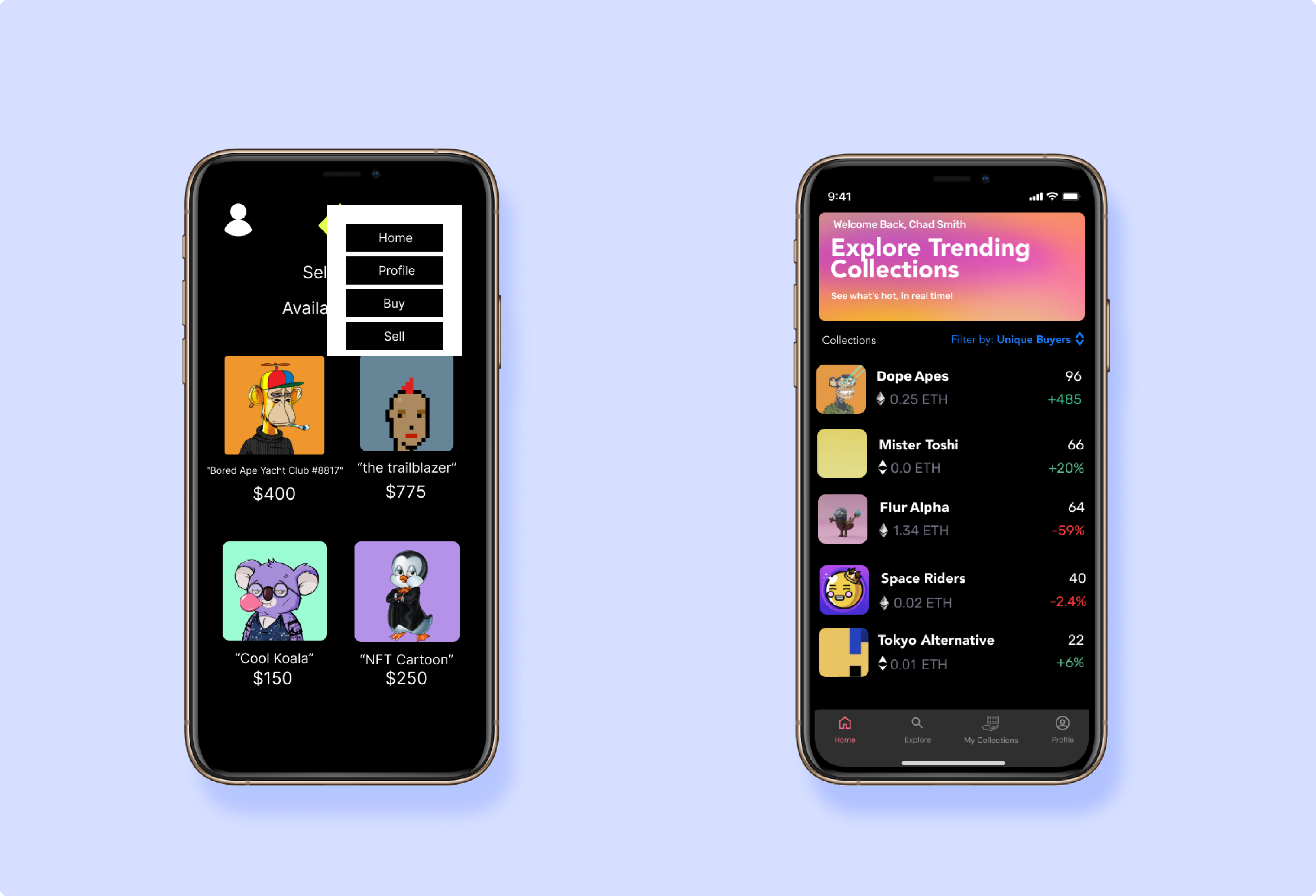
- 5) A menu bar rather than a hamburger icon would be more navigable for a user
- 6) Allow users to edit profile.
- 7) Make a distinction between headers and body of app.
- 8) A way to favorite an NFT may be helpful for a user.
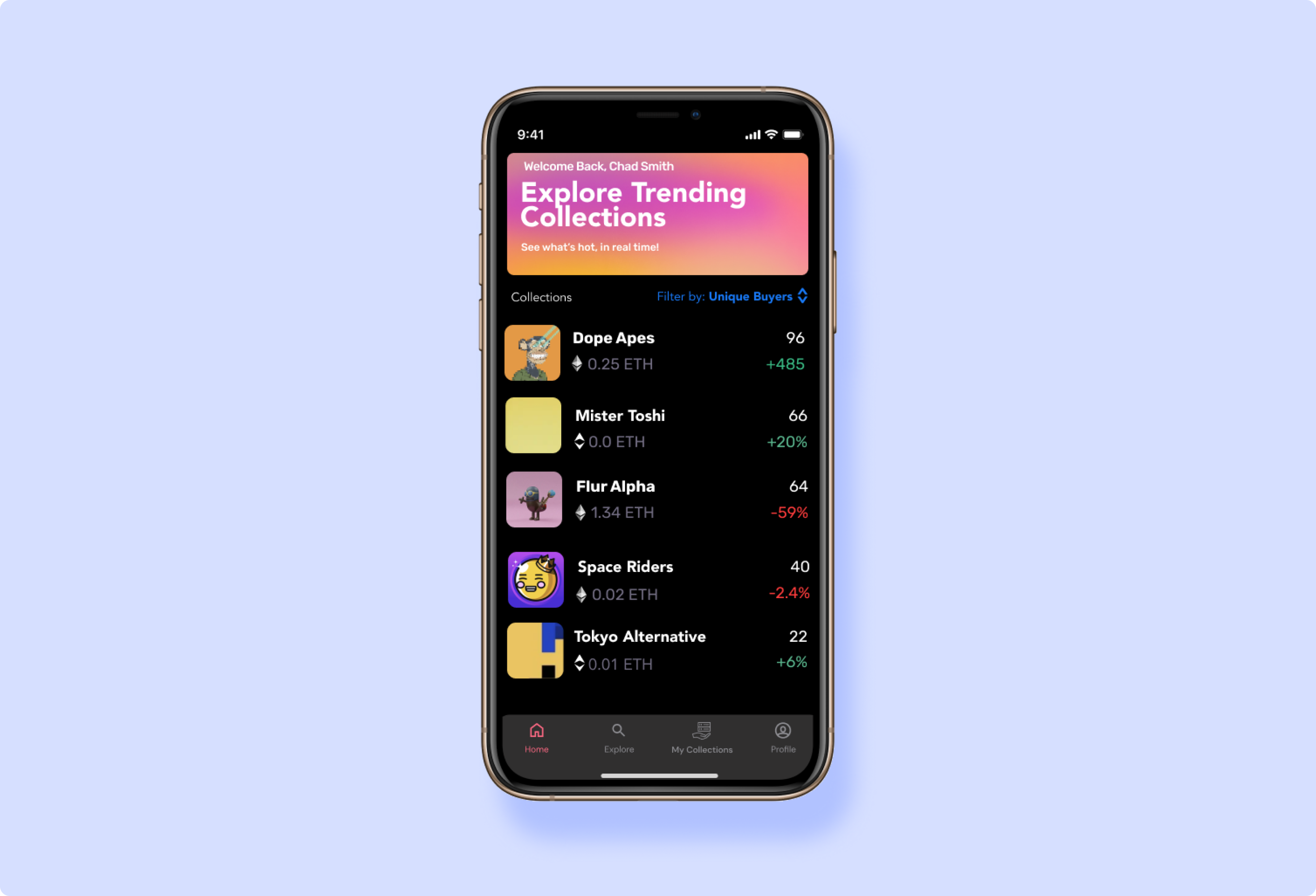
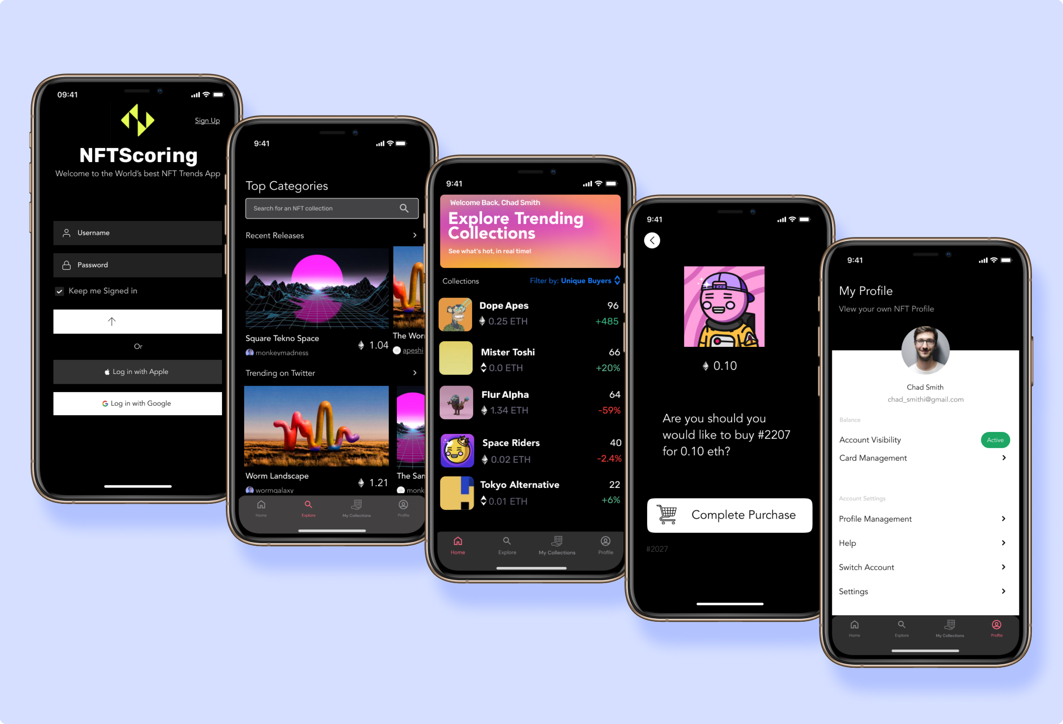
The critique made us realize that our design was actually quite ineffective and we had lost sight of some of the original goals of the product. While there were simple fixes to many of the interface complaints, with the overall design we had emphasized the wrong features and neglected what should have been front and center: analysis and investment information. From our criticisms, we redesigned the prototype into what you can see below:
In this design, we chose to increase contrast in the interface to make it more readable, integrate a nav-bar, make different screens have noticably different appearances, and emphasize the analytics aspects of the app by adding new information to each description and an explore tab.
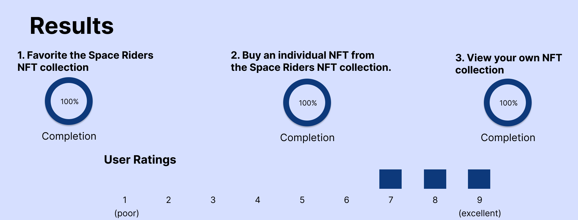
To see how effective this new design was, we conducted three user tests on UserTesting.com. We gave testers the following prompt:
You are an avid collector of NFTs (essentially unique virtual trading cards) looking to buy and sell NFTs. Instead of a mobile app, you will be using an interactive mockup on prototyping software to simulate the experience of using your phone. When the prototype loads in, click where you would be tapping your finger on a phone to use the interface. Buy and sell an NFT using the platform, and try to think aloud while using the interface. You will not need to enter information to use the platform, simply press “login” once at the sign-in screen.
and asked them to complete the following tasks:
- 1) Favorite the Space Riders NFT collection.
- 2) Buy an individual NFT from the Space Riders NFT collection.
- 3) View your own NFT collection.
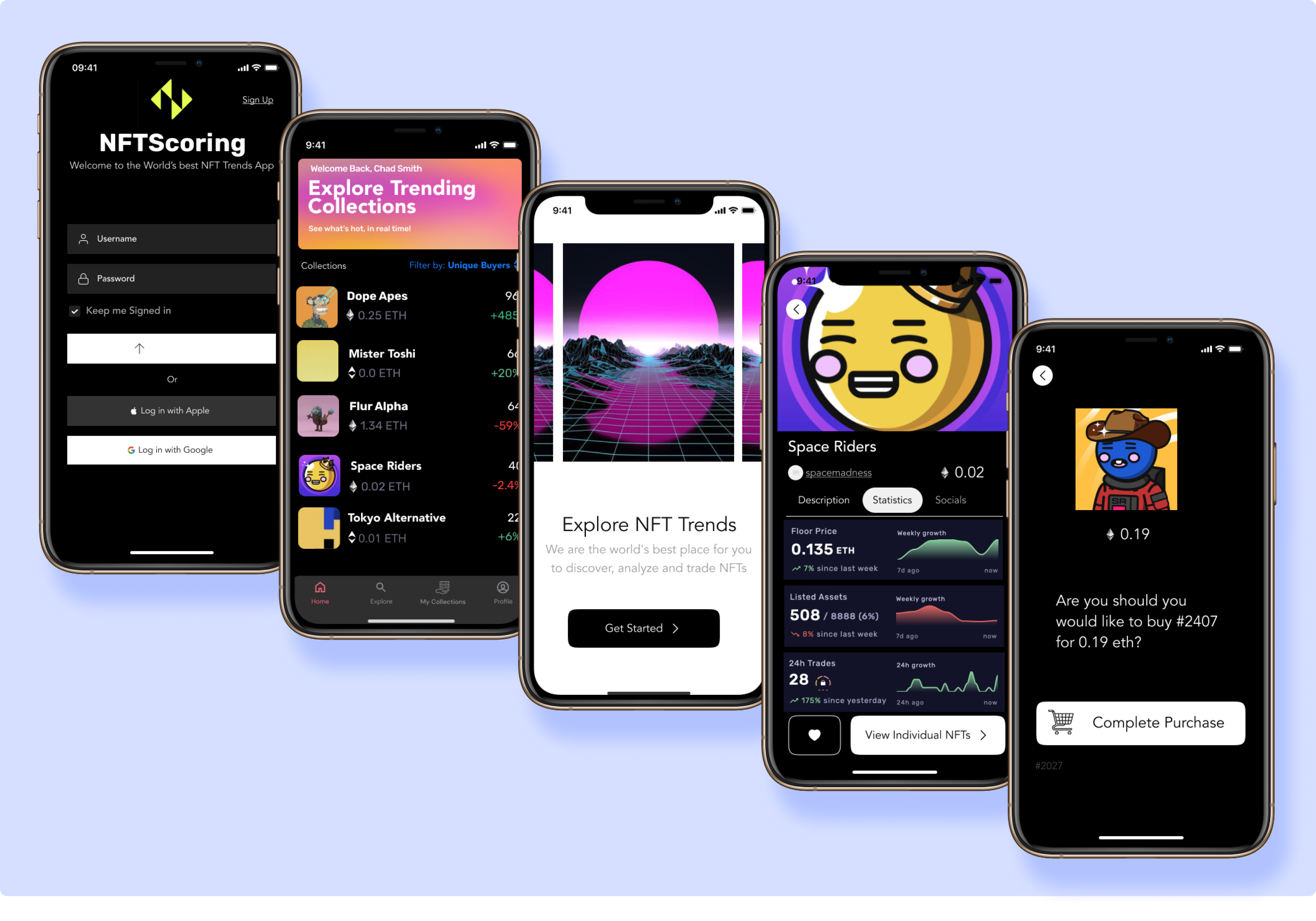
In these tests, our prototype performed much better than in the critique. All three users completed all three tasks, and most of the main difficulties were due to an unfamiliarity with Figma. We did get a few suggestions which we took and changed the prototype: namely, we increased font size on the nav bar and allowed users to view their favorited NFTs on their profile page.
After we made our tweaks, informed by the user testing, we considered our project complete (given the three week timeframe). This is our final design:
I am always wrong -- and iteration makes everything better. This project emphasized just how wrong my design intuitions can be. Our group reached completely the wrong conclusions from our sketching and developed a prototype that did not at all fulfill the goals of the product. Fortunately, this project showed that we don’t have to be right the first time (and we most certainly won’t be). By getting the design in front of other people, we were able to find out exactly why we were wrong, and how we could fix our assumptions. This project demonstrated to me the strength of iteration in designing great products, and I like to think about this project when I get caught up theorizing grand ideas in my head. While they may turn out to be exactly as I imagined, they most likely will not; by simply acting and adjusting enough though, something great can still be created.